2020 Troy Football Uniform Ranking
Every year, I think back on how the season went and, of late, the work of the Trojan Equipment staff has given me plenty to think about when it comes to what Troy wears. I finally decided to do a year-end review of the looks Troy wore during the 2020 season.
Keep in mind, I am basing this simply on my opinion of the look and how I felt it represented Troy. These rankings have nothing to do with wins or losses and definitely aren’t intended to reflect negatively on all of the Trojan Equipment’s hard work. Without further ado, here’s the ranking.
#11 – Smoke/White/Smoke vs BYU
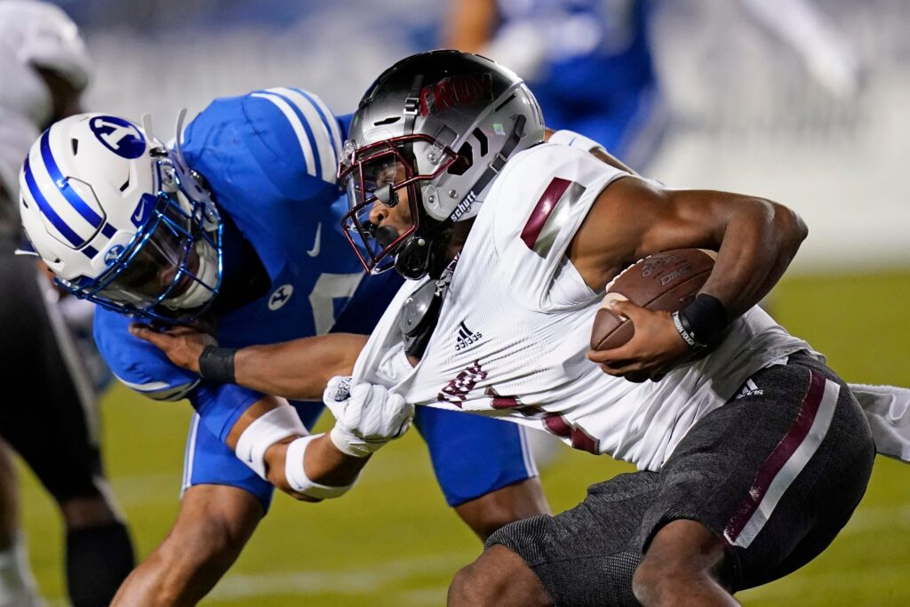
When Troy announced the retirement of the Chrome Domes in the summer of 2020, I was dismayed, as I’d grown to love the look. I was partly happy as I thought this might mean the return of the black Power T helmet, a helmet I’ve long called for to make a return. Instead, we got the Trojan Smoke helmet, a very modern look unlike anything Troy has ever worn.
It should be said, I am very much a traditionalist when it comes to uniforms, but I wanted to give Trojan Smoke a chance. I was even more excited when I saw that we were going to be wearing a cardinal Troy wordmark on the helmet against BYU. That was where my excitement peaked. The overall uniform was a nice look, especially the white jersey over black pants, a look Troy has very rarely used. The problem was that the cardinal TROY on the helmet looked great in the uniform reveal video which was shot during the day. However, the wordmark faded into the smoke and made Troy’s name almost illegible in Troy’s first regular season ESPN game ever.
#10 – Smoke/White/Cardinal vs Georgia Southern
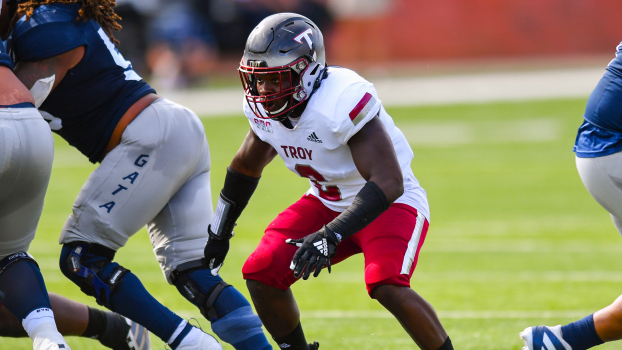
This version of the Trojan Smoke helmet worked much better than the BYU game, opting for the white and silver Power T with a cardinal outline. It absolutely popped off the helmet and looked great, especially with the chrome cardinal facemask. However, where this fell apart for me is the pants. The Smoke with a white jersey looks good (with the Power T) and the white over cardinal pants looks great as well. But all three together just came off looking discordant.
#9 – White/White/Cardinal vs MTSU (Part II)
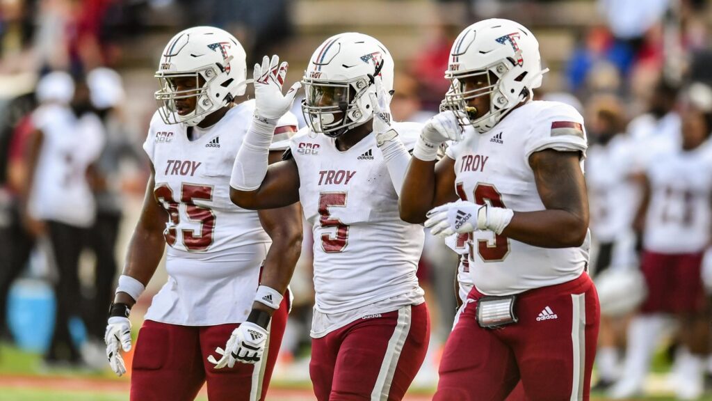
This look is particularly notable for being the first time Troy has ever worn white at home. Troy has had a good tradition of uniforms for Military Appreciation day and this was the first game since starting it in earnest that Troy did not wear its “War Machine” grey uniforms. This look is a very good and clean uniform and, while I really have grown to like the “War Machines” each year, I wouldn’t be mad to see this look again.
Read more about the Military Appreciation Uniforms here.
#8 – Smoke/White/White vs Arkansas State
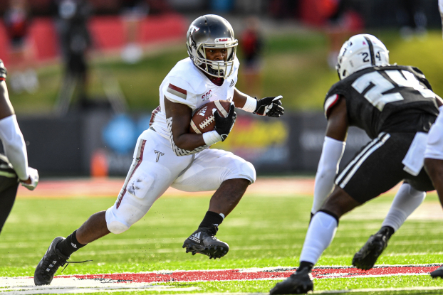
Maybe it was Bray Wyatt.
Maybe it was Arkansas State going with the exact opposite look.
But one thing is clear, this was the best look involving the Trojan Smoke helmet this year. Outside of the full Trojan Smoke uniform that was revealed in the summer with the helmet, this is my favorite use of it. The silver facemask highlights the white portion of the helmet, while just like the Georgia Southern version, the Power T jumps right off the helmet.
#7 – All Cardinal vs Coastal
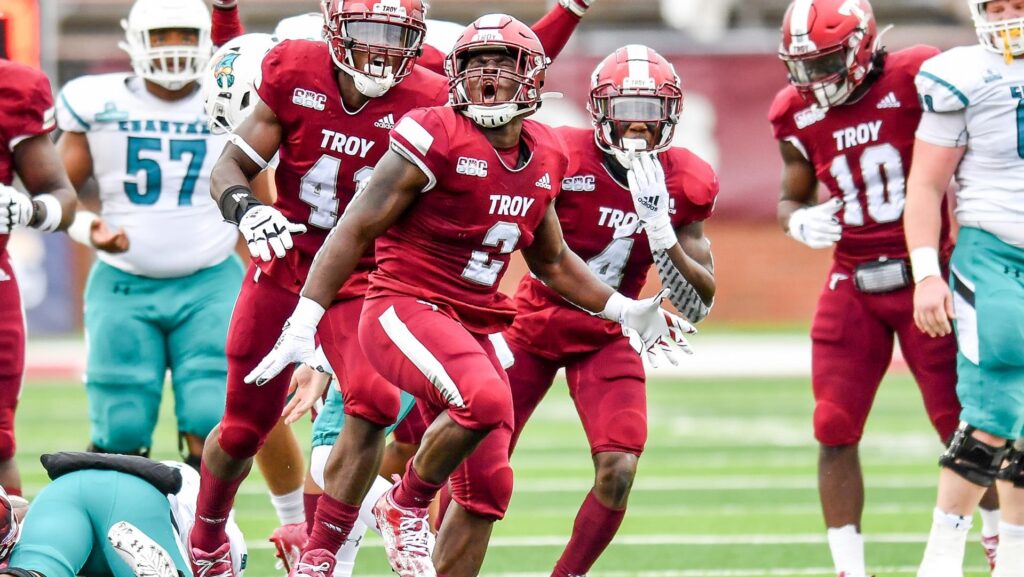
Ever since The 2004 Rebrand one of my favorite looks is when Troy goes all cardinal. (One of the best uses of all cardinal was in the 2008 New Orleans Bowl against the yellow-clad Southern Miss, in a game I lovingly refer to as the Hot Dog Game.) For this version, I have to give tons of credit to Trojan Equipment, as I fully expected this to be the game we would finally bring out the full Trojan Smoke uniform. Instead, they put cardinal completely on display for a national audience, from the players’ heads to their feet. The helmet featured the cardinal facemasks and the first use of the cardinal and silver Power T on the cardinal helmet. They even made sure to give the players cardinal socks and shoes to complete the effect.
#6 – White/Cardinal/Cardinal vs Texas State
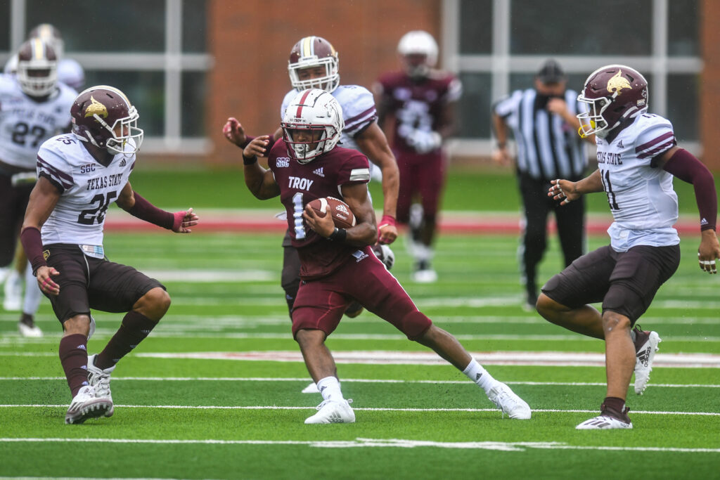
Ever since we brought them back from the dead in 2015, I have been a sucker for the white helmets. The use of the cardinal jersey and pants makes the helmet itself stand out so much. I would say that this is easily one of our more underrated uniform combinations Troy has used in recent years. I think the rain ended up making this look even better as the game went on.
#5 – Cardinal/White/White vs That School in Mobile
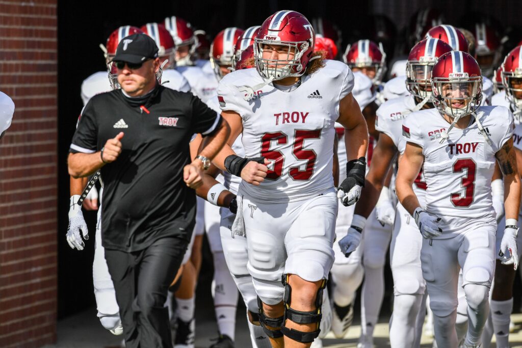
In essentially the opposite look as #6, I can say this is one of the best combinations that Troy brings out, even back when we used it a few times in the 2004-2014 period. As for away looks, it isn’t overbearing and lets the cardinal and Power T speak volumes in representing Troy. The silver of the facemask and cardinal of the helmet form a parallel between the helmet stripe and the jersey and pant stripes. Even in light of the other potential combinations, I would lobby for this being the permanent away look, if not for a couple of others.
#4 – Cardinal/Cardinal/Black vs EKU
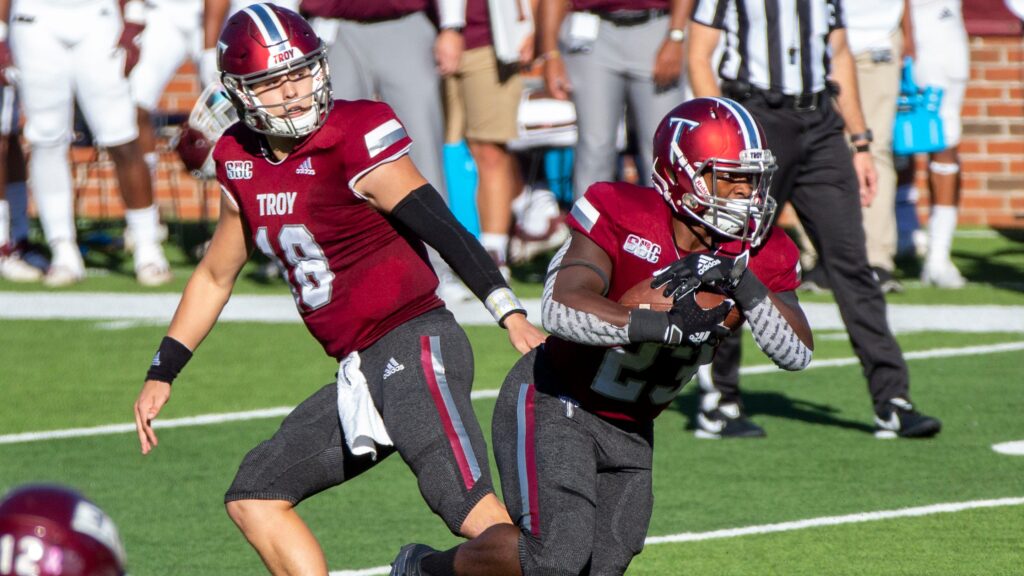
Cardinal/cardinal is never a look that will make me angry, but putting it with the Smoke pants created a brand new look that has very rarely been seen on Troy players before. Before 2013 and the first true Blackout, Troy really only had three colors for pants used in the past: white, silver, and cardinal. Finally, Troy has a dark pant set that really works with any jersey Troy chooses to wear since they’ve found a way to perfectly match the pant and jersey stripes. I would very much love to see this combination in the future.
#3 – Cardinal/White/Cardinal vs MTSU (Part I)
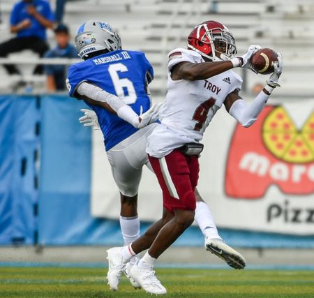
I was so happy with this game from a uniform perspective on both sides. This was a classic Troy-MTSU matchup with each school wearing their traditional looks for home and away. The cardinal/white/cardinal is a combination that always makes me happy to see brought out because it really lets the cardinal shine and is a quintessentially Troy look. If anything could be changed here, it would simply be to see the white/black/white helmet stripe come back on the cardinal helmet. Otherwise, this is a great look for Troy.
#2 – Stormtroopers vs App State
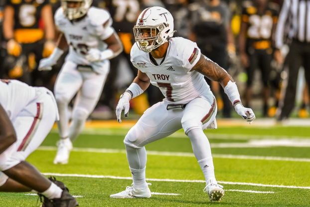
This is the all time best road look for Troy (and really almost any team). The Stormtrooper or Iced Out look, whatever you want to call it, looks great against the color combo of an opposing team. The fact that the Trojan Equipment team went so far in the details on this one led to me loving it so much this year. They used the white/cardinal Power T along with the chrome facemask to give this a truly unified design so that every instance of cardinal just leaps off of the uniform. Bravo to the whole Trojan Equipment team on the best away combination of the season!
#1 – White/Cardinal/White vs Georgia State
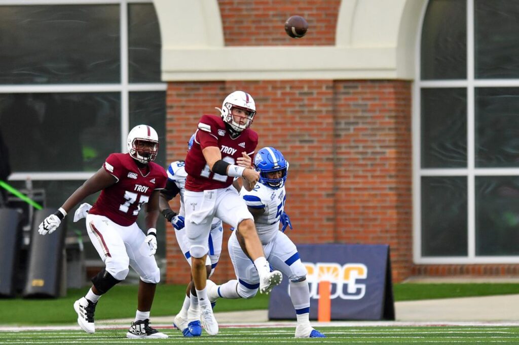
We here at The Trojan Wall are very, very big fans of this look and will praise it any time it gets used. There is a simplicity about this combination that creates an understated, refined look on the playing field. Even as uniforms get more modern, this look defies modernity by allowing itself to look timeless. This also harkens back to our use of this very combination in the 1940s-1960s home games. Everything here is in perfect balance with cardinal accents on the white helmet and pants and white accents on the cardinal jersey. This is hands down the best look Troy used all season long and it would be very near the top of any uniform combination we’ve ever used.
That’s my ranking of Troy’s threads this season. I hope you enjoyed and if you want to let me know what you think, leave a comment on what your favorites were from this season.
Again, much praise needs to be given to the hard work of the Trojan Equipment staff who came up with great looks for the Men of Troy to wear and got them ready to play each week. Their work was even more impressive this past season, doing everything they normally would, but with the added difficulty of working around COVID. They are definitely some of the unsung heroes of Troy Football.

