2022 Troy Football Uniform Ranking
I’ve already said over on Twitter that this is, by far, the most difficult ranking I have done so far. This year, week in and week out, Troy Football and the equipment staff have done their best to have the Trojans looking their best. Because this is the closest yet, I had to be extremely nitpicky to fill out this list.
Note: A few of these are listed as first time ever, even though they look similar. Uses of the Icy Whites are not listed as being the same as the Chrome Domes or Whites and will therefore be counted differently.
Honorable Mention: This Dude at Troy-Army
For the first time in the history of my rankings, we have an honorable mention. I present you with The Bravest Man Alive.


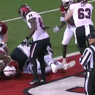
I was lucky enough to not just see this brave soul not once, but twice, which is how I got the photos. He was wearing what appeared to be a replica Demarcus Ware 2004 home jersey.
I say replica because the sleeve stripes are all sorts of wrong and I don’t even have to expound on that color difference (cardinal vs bright red).
Look closely at the numeral four in the middle photo to see why this fellow is, in fact, the Bravest Man Alive. This jersey might be a replica, but it appears to have the signature of the greatest Troy defensive end, one of the greatest defensive Trojans, future Hall of Famer, and one of the greatest NFL defenders in history.
I just don’t even know what to think about this man’s thought process. To paraphrase the most famous college professor of all time, Indiana Jones, that belongs in a frame in my classroom!
On second thought, home. Not sure I trust the school kids that much.
#14 vs ULM (first use ever)


Let me start by saying this. There is so much to love about this combination. I love the silver and chrome accents on the black helmet, especially the return of the Tri-stripe!
I really love the white TROY and numbers, which pop on the Smoke jerseys. It provides a cohesive look from top to bottom with the accents of white and black going throughout the whole uniform.
But none of that tells you why I picked this for the bottom spot. Again, being nitpicky, it all came down to two issues.
First is the Smoke jerseys. I really like them, but wearing them with a black helmet means that there isn’t enough distinction to distinguish it from a black jersey. In fact, we here at the Wall believed it was black at first.
The second issue comes down to that nameplate. I’m not sure why cardinal was used here over white, but it made the names unreadable. Without those two nitpicks, this was easily a Top 5 look.
#13 vs Alabama A&M (first use ever)


If any pick on this list might be controversial, it could be this one. I love the Icy White helmet, especially with the cardinal accents. I also very much love the pairing of a cardinal jersey with the black pants.
The problem for me is the pairing together. It’s not a bad one by any means, but it just doesn’t work for me.
Maybe time will be kinder to this one, but I wasn’t a fan when we wore the Chrome Domes with this combo in the 2019 Georgia Southern game.
#12 vs South Alabama (first use ever)


Overall, this game could’ve been pretty close to perfect if those folks from Mobile brought back their blue helmets.
Unfortunately, they didn’t. They also didn’t get to win the Belt either. For the FIFTH STRAIGHT TIME.
As for the uniform, this one had only one real nitpick and it is a problem that I had with the Icy Whites in general. If the decal is too white, it gets lost in the shine of the shell.
That happened a lot with this Power T set, as well as another great one on this list. Other than that, this is a great look that is only down this far because so many other combinations were better.
#11 vs Ole Miss (17-31 overall, #3 in 2020)


If anything typifies the success of Trojan Equipment’s work this year, it is this entry. The cardinal/white/cardinal uniform (a stalwart in the Trojan locker room) dropped from #3 the past two years down to #11.
Again, there’s nothing against this combination; there’s just so many more combinations that looked better.
I really love how the silver, cardinal, and white are all balanced throughout the uniform, from the facemask and decals to the pants stripes. It creates a clean cohesive look that is helped by the new away jerseys.
They feature a larger TROY font which, along with the numbers, is outlined in black for great contrast.
#10 vs WKU (2-2 overall, not used since 2015)


In probably the rarest of the repeats from this season, Troy first debuted this back in 2013 vs ULM. It returned twice in 2015, but died after the shuttering of black helmets in 2016. Thankfully, it returned again in what proved to be a legendary comeback win over WKU.
I have long wished for black helmets to come back and love this combination. The only reason it is so low is the chrome decals blending in a little too much to be seen on the shiny black.
#9 vs Arkansas State (3-3 overall, #7 in 2021)
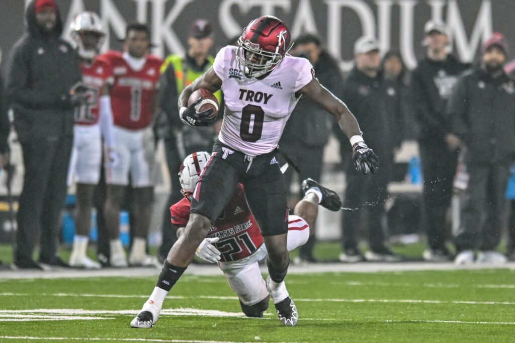
This one is another that featured a subtle change late in the season that I truly loved. Trojan Equipment added a matte black stripe to the cardinal helmet while wearing the black pants.
I’m not sure whose idea it was to start matching the decals/facemask to elements in the jersey and pants (probably Ian Grier), but I’m very pleased with this change.
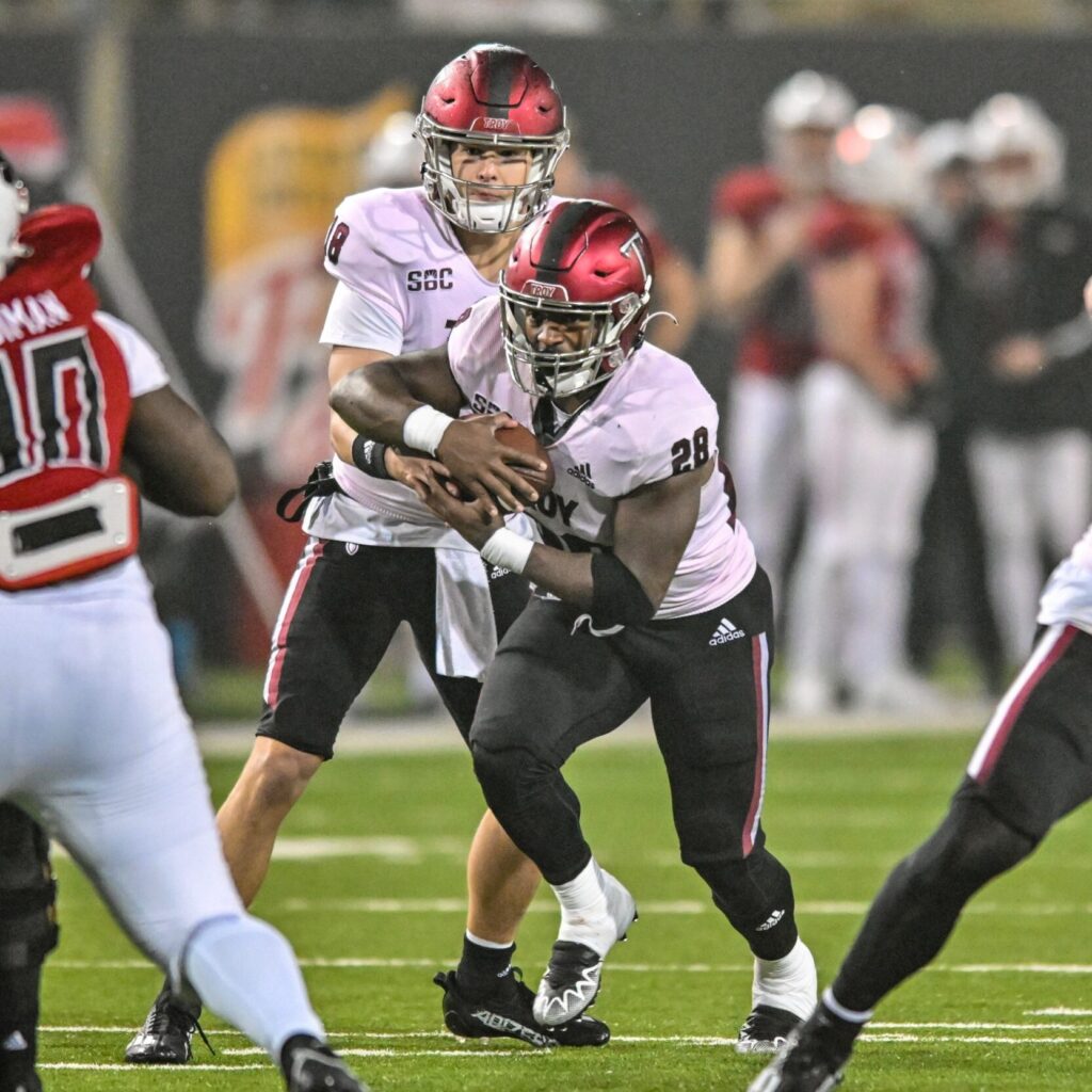
#8 vs USM (2-0 overall, not used since 2018)


It’s hard to believe this has only been used once, especially after Troy reused those 2013 Blackout jerseys a few times and they had all the elements for it. (The only years from 2013-present we didn’t wear at least one black jersey during the year were 2014 and 2020.)
This combination was probably put in the back of the closet after the 2018 Texas State game that we don’t speak of.
I really liked that Trojan Equipment played with the throwback look, after 2019’s cardinal/cardinal/black. This mix works really well and I thought it brought the focus back on the cardinal, especially the helmet.
While I love seeing Troy don the logo it won two National Championships with, I really enjoy seeing Michigan State fans losing their minds on social media.
Speaking of the throwback, if I could change anything I would have full-on throwback uniforms. As I know those are EXPENSIVE, I’d settle for a return of a more traditional look to the throwback helmet itself.
The chrome stripes are fine, but I would love to see the black/white/black tri-stripe from the period, like Troy used with the 1968 throwbacks.
#7 vs Louisiana (2-0 overall, not used since 2015)


This is another one that surprised me as I put the list together. I love the black/white/black look and the details that tie this together.
Trojan Equipment found a perfect combination of decals to match the black helmet and black pants together. The fact that it was paired with the new away jersey for 2022 just made this even better.
When all was said and done, much as I loved this one, it is ranked so low because there were just simply more that worked better.
#6 vs App State (first time ever)


Without a true white helmet, Troy lost the ability to use the Stormtrooper look, but that wasn’t necessarily a bad thing. The Icy Whites in this were essentially the same as the ones used versus Alabama A&M.
I think this worked a lot better than the A&M game because the cardinal accents in the white jersey and pants make the school color just pop off the uniform.
This was easily the best road uniform of the year for me. I hope we see it more over the next few years.
#5 vs Marshall (1-1 overall, first time since 2015)


In my mind, this is a new classic, not just because Troy beat Marshall again in The Vet. This uniform set continues to blow me away with how great each element works together.
The white decals on the black helmet echo the black jersey over the white pants. The cardinal in the jersey mimics the cardinal in the pants stripes.
It’s like poetry; The Aeneid, if you will. It rhymes.
#4 vs UTSA in Cure Bowl (3-2 Overall, used vs WKU in 2022)
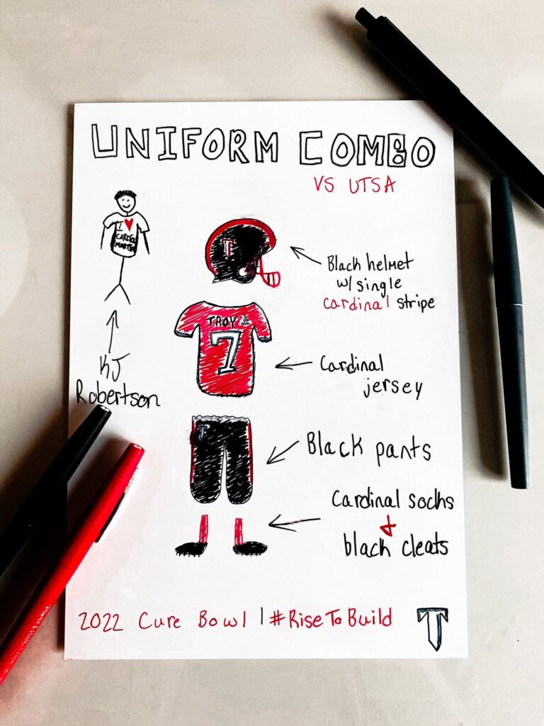
Trojan Equipment finally broke a little known streak to great results in the Cure Bowl. They hadn’t repeated a uniform combo in the same season since 2018, when they wore white/cardinal/white against both UL and Buffalo.
I absolutely loved this uniform, almost as much as the clever (and cost-conscious) final uniform reveal of the season.
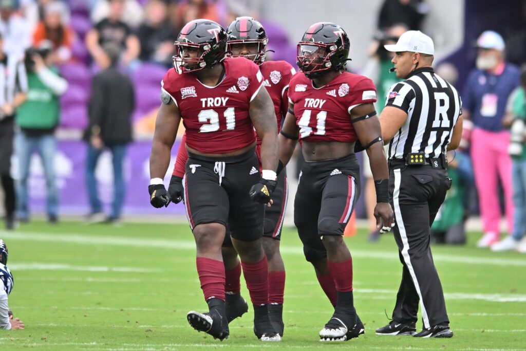
Much like the #5 selection, the uniform works so, so much better with the right decals. The original version of this combination only made it to #10 because the decals didn’t work, and switching the silver for cardinal made this a great look.
It’s definitely one of the best black/cardinal/black combinations we’ve used before.
#3 vs Army (first time ever)


I said in my 2021 Uniform Rankings: “Maybe Trojan Equipment will shake things up and put the Stars and Stripes Troy script on the Military Appreciation helmets soon.”
I don’t know if they read this (or my many tweets about it), but they finally did it. I couldn’t be happier.
I’ve loved the Troy script since AD Brent Jones introduced it around 2019. (More on the script later.)
Short of the return of the War Machines, I really like the idea of the cardinal jersey and pants for the Military Appreciation game. The only bad part of this uniform had nothing to do with how it was put together.
The combination of the logo and the icy whites caused the decals to be washed out depending on where the sun was during the game. That’s the only negative mark on this amazing look.
#2 Sun Belt Championship vs Coastal Carolina (first time ever)


Every time the Trojans get a new helmet design, I have a hard time getting used to it. I can see the potential, but it always takes a little while before a combination works and it just comes alive for me.
The Sun Belt Championship game was that game for the Icy Whites. I am a well-known proponent of the tri-stripe and this one worked so, so well.
It was as close to the Greatest Uni Combo PossibleTM (White/Cardinal/White) as could be achieved with the Icy Whites. The helmet was very reminiscent of the Arkansas Cowboys helmets from a few years back and I think the Trojan ones look even better, but bias and all that.
I hope this combination makes another appearance in 2023, maybe in the last week of December again.
#1 vs Texas State ( 15-7 overall since 2004, last used in 2019)


As soon as KJ Robertson walked out of the tunnel and the script was shown on the helmet, my phone began to blow up.
I’ve made it well known that I love script helmets and that I have long wanted to see Troy with a script logo. It’s always a classic football look and I was elated to see it.
From that moment, this was always going to be #1.
I love the cardinal/cardinal/white and it works so well here. I love the white decals and facemask, which make everything easy to see and vibrant on the cardinal.
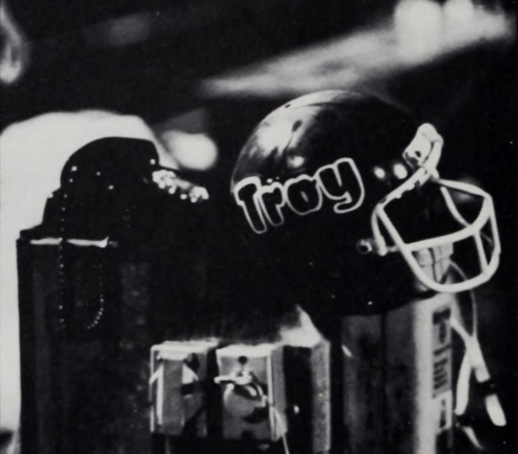
Part of the reason I was so excited is due to my love of Troy history and Troy uniform history. The helmet that made me interested in both was a Bubble Troy (1979-81) helmet I saw inside the original Baumhower’s in Montgomery, sometime around 2006-07.
That single helmet changed my perspective and made me interested in more of Troy’s history.

Make do silver pants (Black or Cardinal) jerseys and Silver helmets. Might be nice like the others.