2023 Troy Football Uniform Rankings
After the excitement of the 2023 football season, most Trojans have pivoted towards basketball and the upcoming baseball and softball seasons.
But not me.
The 2023 season isn’t over until we rank these uniforms. This season created some unique combinations and even featured a couple of never before seen bits of Troy Uniform history.
Last year, I said that one was the hardest to rank so far, but 2023 gave that a run for its money.
#14 vs WKU (2-0 overall, last used 2022)
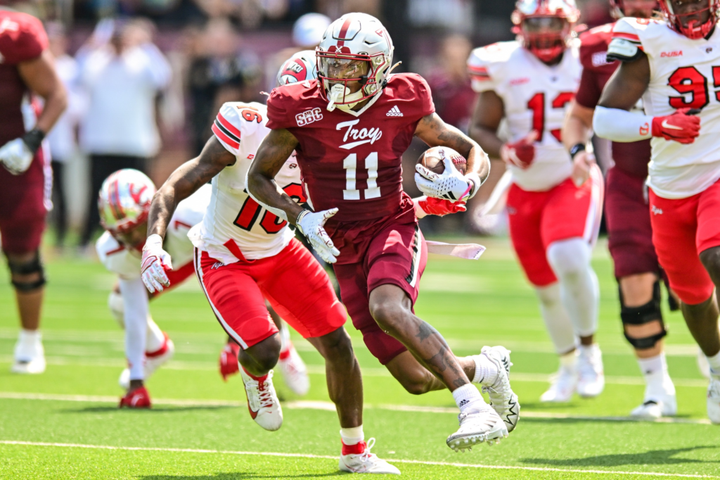
Early in the 2023 season, it became clear something was off with the Troy uniforms, as the first two home games had the Trojans wearing black jerseys. This hadn’t happened since Troy used black as primary jerseys in the 1990s.
Eventually, the Wall learned that Adidas had had a problem with manufacturing the cardinal jerseys, so they were delayed. Trojan Director of Operations Ian Grier worked with fellow Trojan Jace Sanders to create new jerseys, just in time for a tough game against former Sun Belt foe WKU.
The jersey also served as Troy’s first alternate cardinal jersey in team history, with the Troy script emblazoned across the chest. While the white side panels weren’t my style, the jersey worked really well and was a great different look.
The only thing that could’ve made these even better are the white helmets (which weren’t available yet). It would’ve worked better with the white elements on the alternate cardinal jersey.
#13 vs ULM (first time ever)
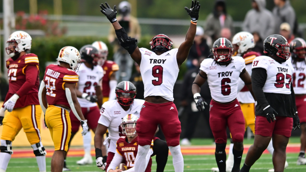
I’m not sure why, but when the Trojans use three different colored items, it doesn’t work as well for me. Troy actually used an inverse of this combination in 2021 vs South Carolina and it rated higher in my list that year than this version.
At the end of the day, I think that I just think that the cardinal pants work better for away uniforms when paired with the Cardinal helmet.
To be clear, this is a personal preference. It’s not even a consensus here at the Wall.
#12 vs Army (First Time Ever)
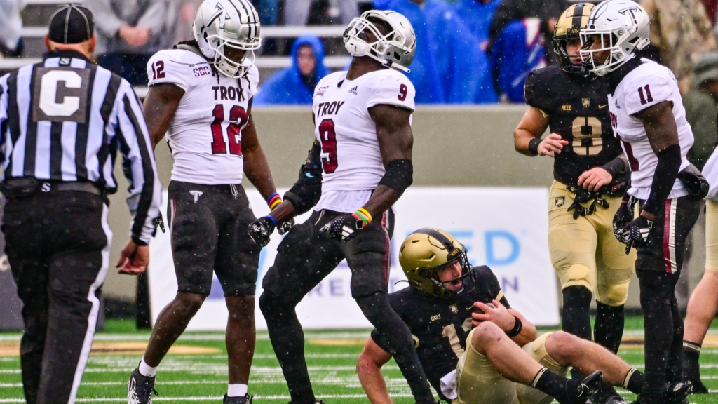
While these look familiar, they are a third version of a similar look. In 2017, Troy wore the Chrome Domes with white jerseys and black pants against NMSU.
In 2020, the Trojan Smoke helmets adorned the same jersey and pants against BYU. Even though these sets use three different helmets, they work much better together than the previous entry.
This is due to the black elements in the helmet and jersey, making everything feel more cohesive than the patchwork look of the black/white/cardinal, in my opinion.
#11 vs Stephen F. Austin (3-0 overall, last used in 2022)
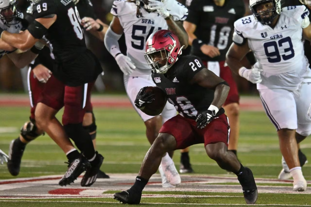
It has been well documented by The Trojan Wall that some of the best looks in Troy history involve matching helmets and pants, with a different color jersey. This one should have rated much higher, but was brought down by the chrome decals.
The chrome stripe is very easy to see, but matching the chrome on the Power T with black rendered it much harder to see in certain lights. Change that one detail and this is easily a Top 5 uniform for the year.
#10 vs 🚫 (5-2 overall, last used in 2021)
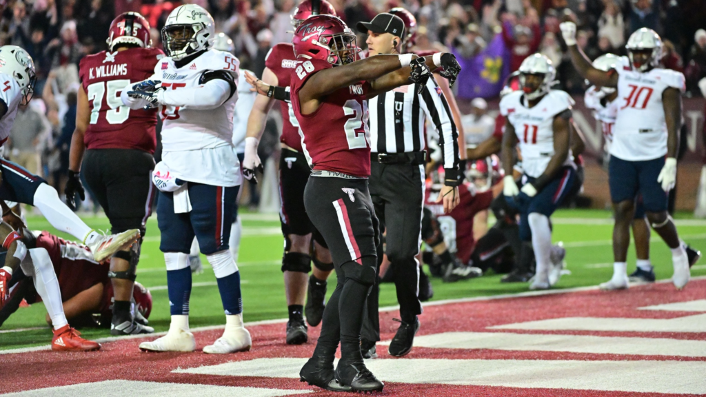
We here at the Wall have prided ourselves on championing the inclusion of the Troy script in the uniform design. So I was a little surprised to find this one so low.
I love the cardinal/cardinal/black look. I love the script Troy. How could it go wrong?
Simple. Just like the previous entry the chrome decals don’t work as well at showcasing the logos on the cardinal helmets as others do. Change this one to the white script Troy and I might have moved this one all the way to #2.
#9 vs Duke (1-3 overall, last used in 2021)
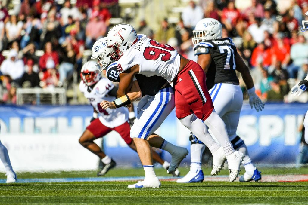
An example of a great uniform being underutilized, the white/white/cardinal gives a very different look for Troy’s home uniforms. You’ll never have to convince me that Troy needs to wear a white helmet, for instance.
The cardinal pants give the away look a bit of depth that is sometimes missing from the usual away combos. The problem is that Troy has only won once wearing this set.
#8 vs Louisiana (2-0 overall, last used in 2022)
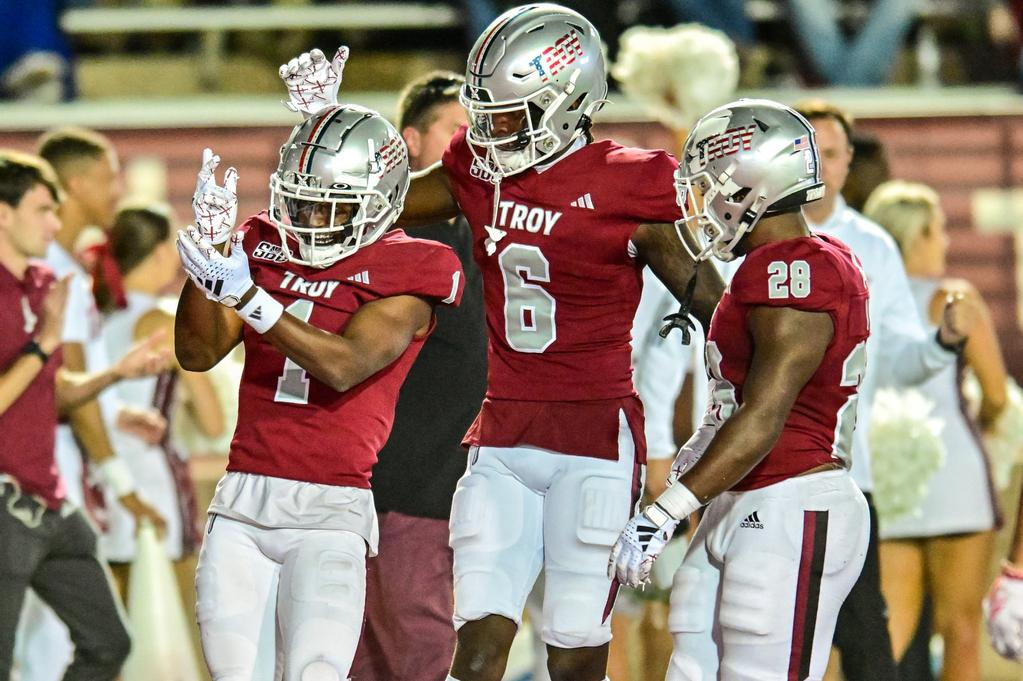
The TROY wordmark returned for the first time since the 2020 BYU game and it worked so much better here. Though simple, the stars and stripes logos are always a highlight of the Military Appreciation games. This combo is just an elegant solid look all around.
#7 vs Arkansas State (16-7 overall, last used in 2022)
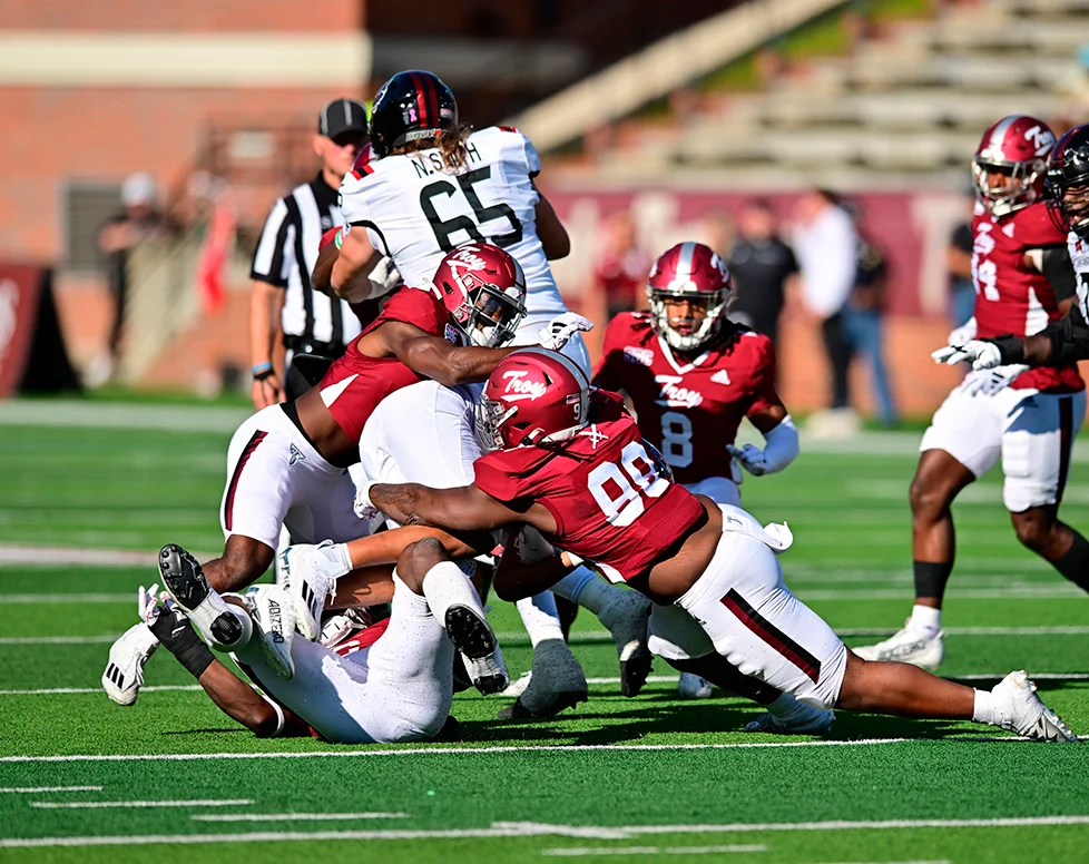
I absolutely love cardinal/cardinal/white as a home look. One could even make the argument that it is the second best home look (We’ll see what the best is later.). However, the reason this one ranked so low will very much surprise you.
There’s too much Troy script.
I know. I’m as shocked as you are.
Troy script on the helmet is great and on the jersey works well too, but too much of a good thing does exist.
#6 vs Southwest Texas State (1-1 overall, last used in 2022)
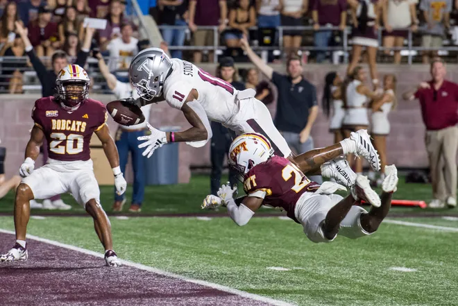
Another seemingly basic look that worked wonderfully. I thought initially the white decals wouldn’t work on the silver helmets, but man did they actually pop. Mixed with the all whites, it made for a great away look.
Props to Texas State for their SWT throwbacks, which are perennially some of my favorite throwbacks of the whole year.
#5 vs JMU (1-1 overall, last used in 2022)
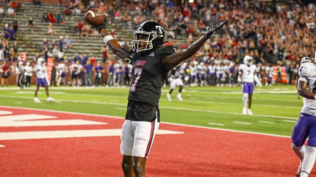
Where to start with this one? The black/black/white is a look that I absolutely love, but it has been sadly underused.
I completely understand why. Cardinal is Troy’s primary color, therefore it should be the primary jersey.
But oh, how good Troy looks in black, especially these, which are probably my favorite black jerseys.
Then that helmet.
I will forever love the TS and I, like others, was shocked when I saw it on the black helmet. It looked great, especially with the white facemasks.
This marked only the second time a throwback logo had been used on a different color helmet than its original. The first time was the TSU logo on the Trojan Smoke logos.
#4 vs Southern Miss (18-31 overall, last used in 2022)
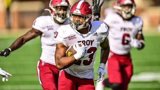
There’s a certain symmetry that makes certain uniforms work. It’s why this one is just so good as an away uniform.
The cardinal just pops in every aspect, including the numbers, that the uniform just turns it into a sartorial Oreo.
#3 vs Kansas State (12-17 since 2000, last used in 2020)
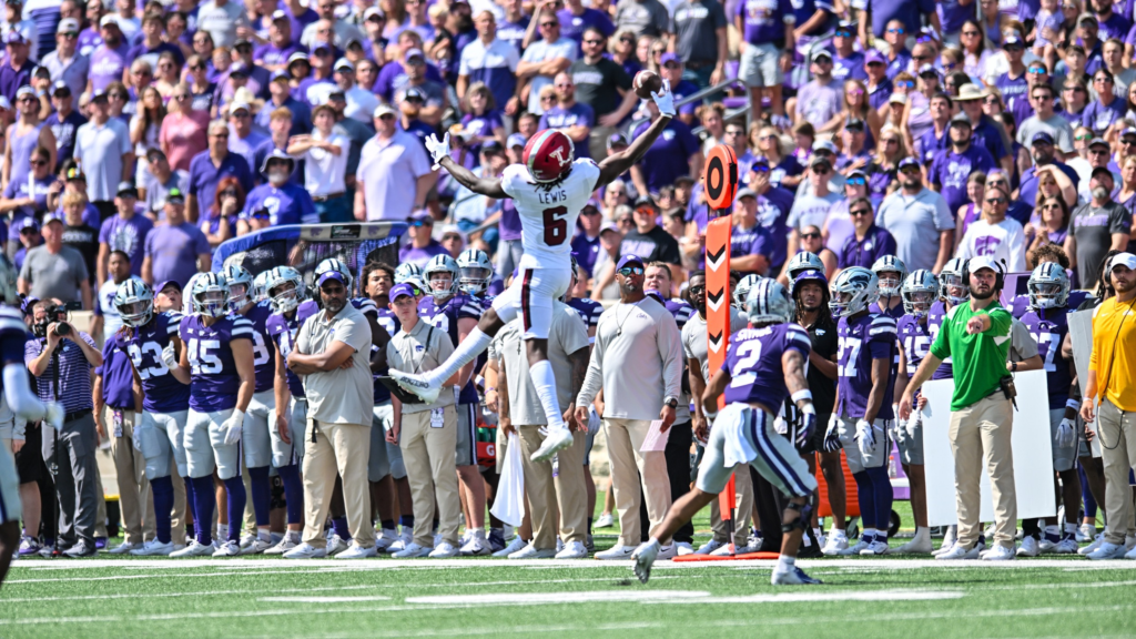
It was a difficult choice to put this one over the cardinal/white/cardinal, but as a helmet guy, there is something beautiful about the helmet being the focal point of this uniform set.
The cardinal just draws in your eye and lets everyone focus on the Power T.
If you thought I was going to be using any other photo for this one than Troy’s introduction to Chris Lewis, then you would be crazy.
#2 vs Georgia State (3-0 overall, last used in 2022)
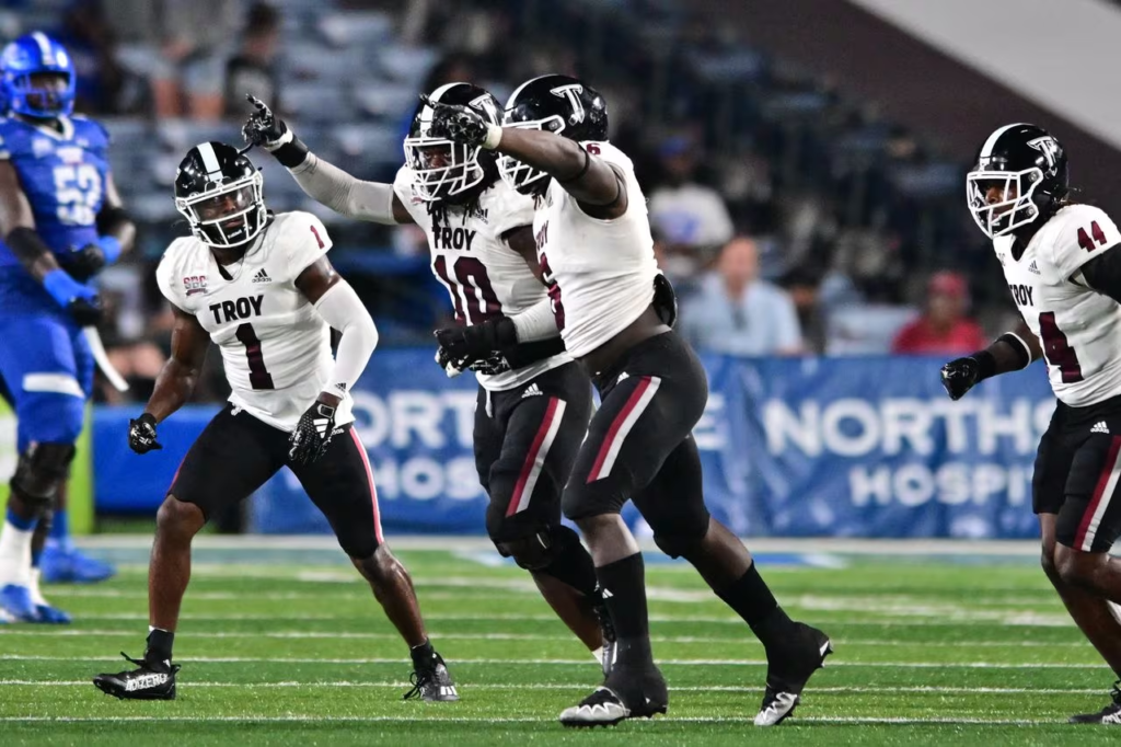
I know I’ve just been harping on and on about cardinal, but I LOVE this combination so very much. One of the negative parts of the 2004 rebrand was the complete abandonment of black as a color in the uniform set.
I know that its inclusion was only really in the 1990s (and a brief time in the 1940s), but Troy is unique among schools for having three school colors. It’s always a shame when we don’t utilize them.
#1 vs App State (7-2 overall, last used in 2021)
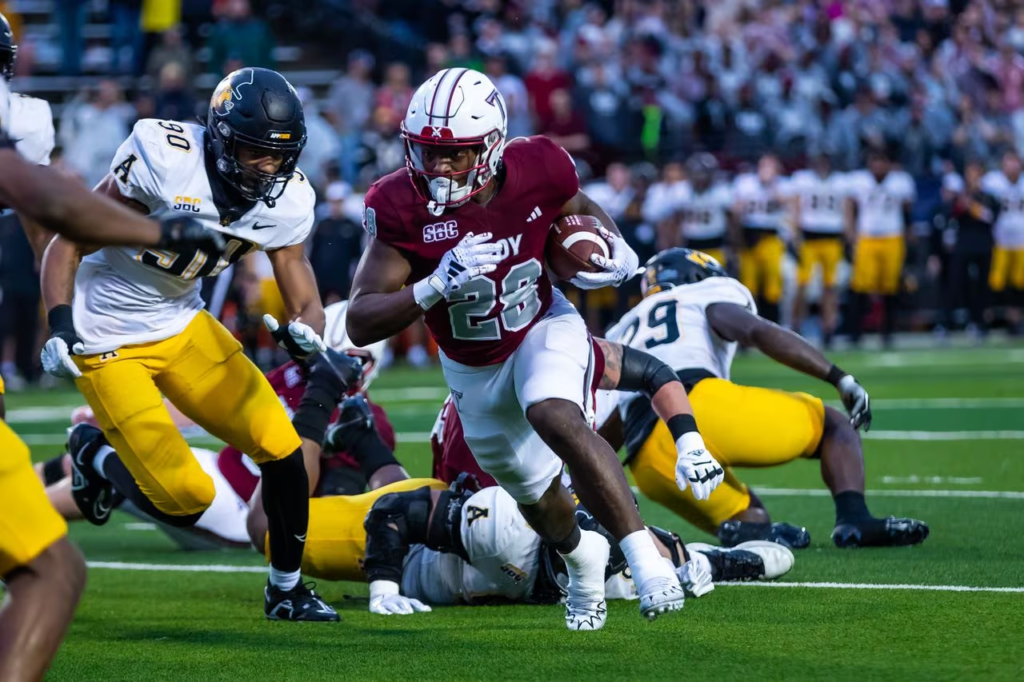
WHITE HELMETS ARE BACK!!!! WHITE HELMETS ARE BACK!!!! WHITE HELMETS ARE BACK!!!!
Okay, now that that’s out of the way, if you’ve followed The Trojan Wall for long enough, then you knew this was going to be #1 as soon as you saw the uniform reveal video.
This is THE Greatest Uniform Combination Possible. Everything else was simply competing for second.
It is pure perfection.
But wait, there’s more! Look closer at the helmet.
Troy has used a tri-stripe down the center of the helmets dating all the way back to 1967, and a single stripe before that. In 2023 though, the Sun Belt Conference Championship Game marked the first time Troy ever used a five-stripe (Cardinal/Silver/White/Silver/Cardinal) on the helmets.
The silver numbers work with the silver stripes on the helmet and pants, elevating the already brilliant look with these accents.
There’s just so much to love about this whole set.
I hope you enjoyed this year’s uniform rankings. Let me know what you think in the comments or on Twitter at @benonsports.

Bravo!