The Ultimate Helmet Ranking of Troy, Part 3 (25-1)
At long last, Part 3 is finally here. The Top 25 helmets in Troy history. This will, most assuredly, be something we can all agree on. (I hope.)
25. Cardinal Helmet with White Stripe and Interlocked Big T and Small S (1967)
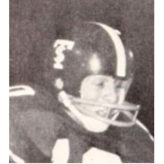
Yes, this does look very similar to the 1968 National Championship helmet, except for one detail: the stripe. The 1967 lid was a great step towards an iconic look for Troy, but it was just not right.
Take away the logo and there isn’t much to differentiate these helmets from those of another school in Alabama. It’s no wonder that fixing the stripe ended up being very special for Troy State in 1968.
24. Cardinal Helmet with White, Black, White Stripe and Interlocked TSU Logo (1973)
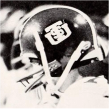
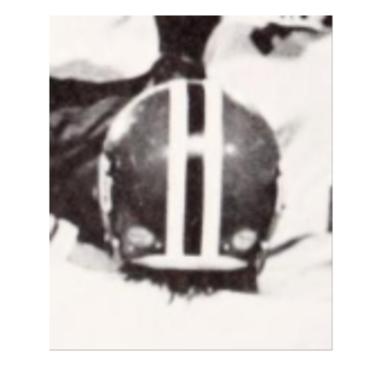
I’ll admit this might be one of, if not, the most surprising picks in the Top 25. It continues the white/black/white stripe tradition of the late 60s to the 90s, which I think you know by now, I love.
The logo is also a great 70s modernization, much like one later, to update the interlocked TS by adding the U. I really wish that Troy used this one for more than one season, but I am not surprised it only lasted the 1973 season, the last of the Tom Jones era.
The Troy helmets of the 1970s were really in a state of flux and in search of an identity.
23. Black Helmet with Silver Facemask, Silver, Cardinal, Silver Stripe, and Cardinal and Silver Power T (Louisiana, 2022)
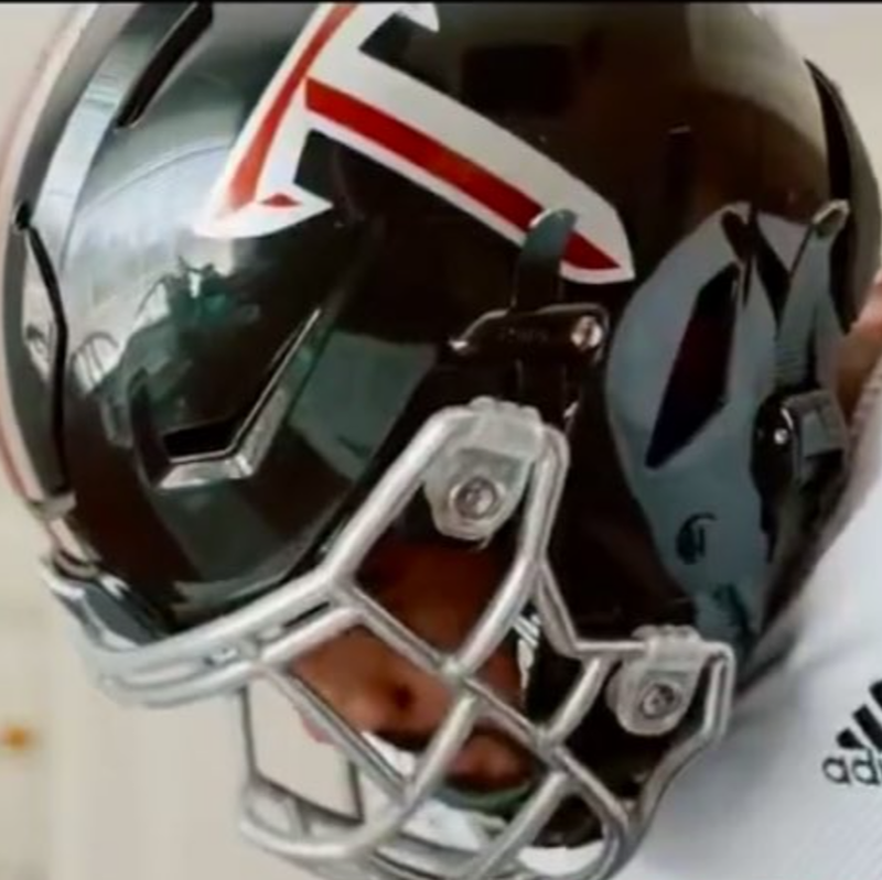
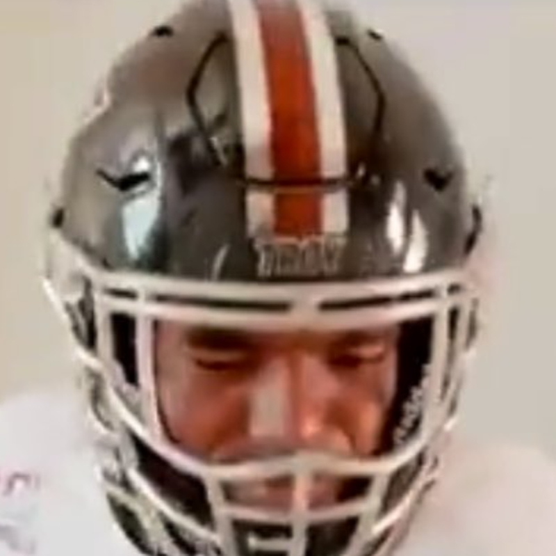
This was a perfect mix of all three school colors. The cardinal and chrome decals and stripe popped right off of the black helmets and the chrome facemasks were the perfect accent to bring the helmet and decals together in one great package.
Also, this was easily one of my favorite uniform reveal videos that Jack Martin and company have done.
22. Icy White Helmets with Cardinal Facemasks, Cardinal Stripe, and Cardinal Outlined Power T (🚫, 2022)
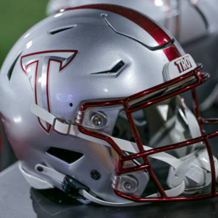
I really thought that this was going to be the high point of the Icy Whites. While very similar to the design worn earlier in 2022, this version used the cardinal outlined version of the Power T rather than just the cardinal one.
The added silver and white from the logo really helped to put some unity between the decals and facemask, both of which absolutely jumped off the helmet.
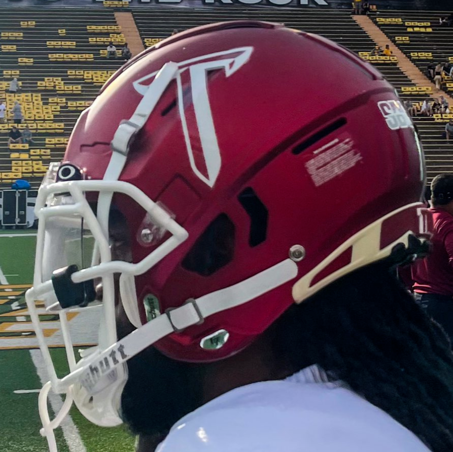
21. Cardinal Helmet with Silver Stripe and White Power T and Facemask (USM, 2021)
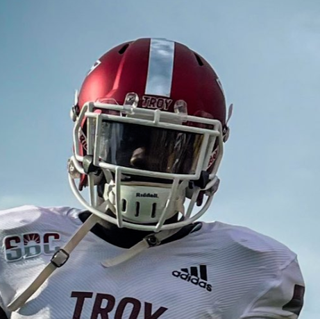
By this point in these helmet rankings, I think it might be clear that my preference in helmets is simplicity. You don’t need to do too much to look great.
There is a reason that helmets like Texas, Penn State, and even that school in northwestern Alabama have helmets that are considered classics.
While I am not always sold on the single color Power Ts, the white one absolutely worked on the cardinal helmet, especially when paired with the rare (in the modern era) white facemask. This one could have been much higher if only for one fault.
The silver stripe was just inconsistent with the rest of the helmet. Add a white stripe and this one could be nearing the Top 10 in my book… well, blog ranking.
20. Cardinal Helmet with Chrome Facemask, Silver Stripe, and Cardinal Outlined Power T (2021-Current)
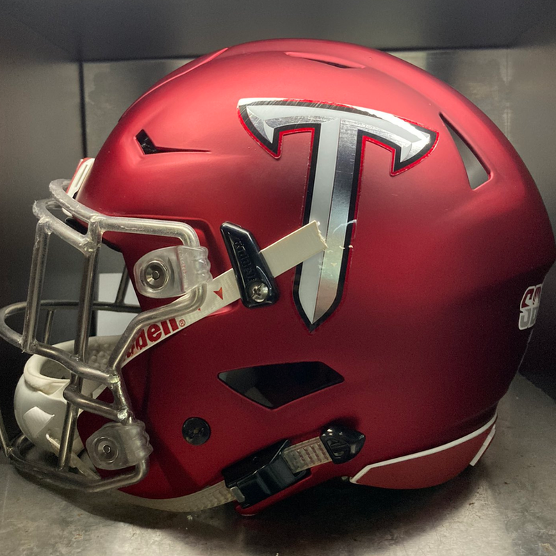
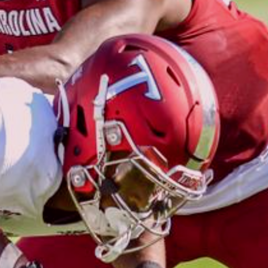
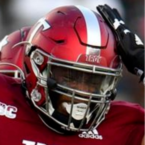
If anything can be described as a standard in Troy’s helmet arsenal, I believe it would be this. Cardinal has long been the main helmet color for Troy, but since 2021, the cardinal and black outlined Power T has adorned this version of the helmet.
The silver of the decal and facemask lend a uniqueness to this version of the cardinal lid that makes it stand out from the rest.
19. Black Helmet with Troy Shield and Sword Stripe (FIU, 2005)
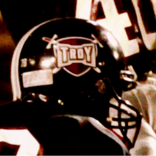
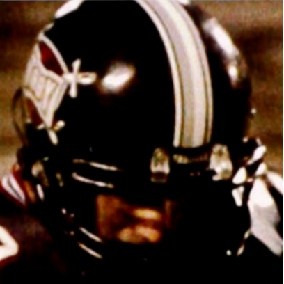
This helmet could easily be considered Troy’s first alternate helmet. Worn only once in the Al Lucas Blackout game, this helmet became a brief look at what Troy could have looked like had we not switched back to cardinal helmets in the 2004 rebrand.
I would have loved for them to have broken these out a few more times between 2005 and 2014, but I ultimately believe that it is better it remains a singular memorial to the life of one of Troy’s best defensive players of all time.
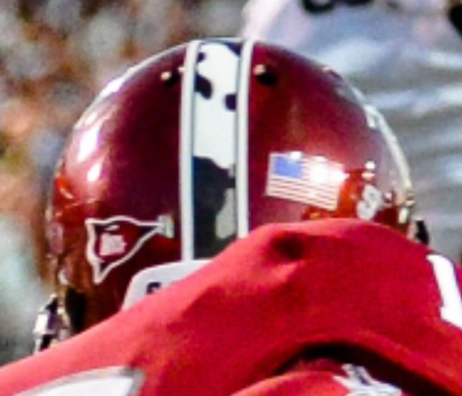
18. Cardinal Helmet with Camo Troy Shield and Stripe (Navy, 2012)
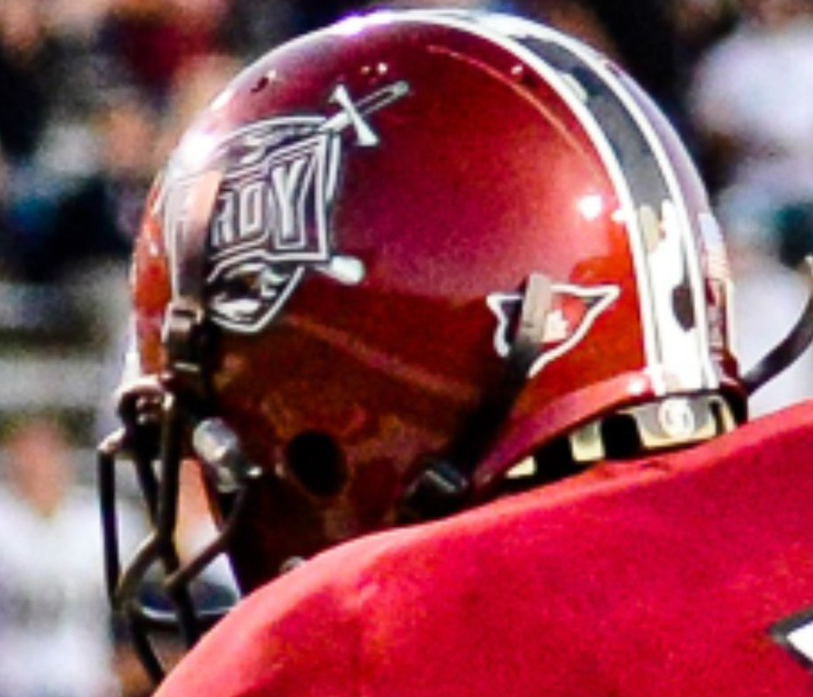
Another one off helmet, this one made its appearance in the 2012 game vs Navy. This marked the Trojans’ first battle with a service academy and happened on the 237th birthday of the Marine Corps, a fact that I am sure was not lost on Troy’s own Marine, Chancellor Jack Hawkins.
Troy honored the military with the subtle camo in the Shield Logo and the camo helmet stripe. These details allow Troy to maintain a consistent look without creating a completely different appearance for the game.
Interestingly, I didn’t realize it until I actually got one of these helmets, but each helmet stripe is different.
17. Cardinal Helmet with White, Chrome, White Stripe, Chrome Facemask, and Trojan Helmet Decal (USM, 2019)
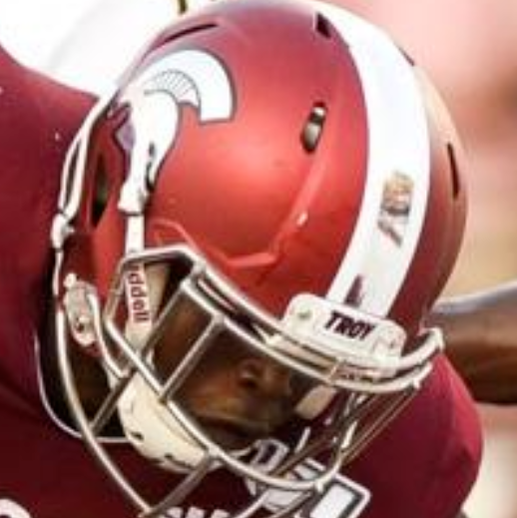
I was so excited when Troy initially brought back the Trojan helmets in 2019, especially since they kept the tri-stripe look. While I would have preferred black, the silver really tied everything up nicely with the silver mask and Trojan helmet decal.
Without the black though, it was a great look just short of perfection.
16. Black Helmet with White Facemask and White, Silver, White Stripe and White and Silver Power T (ULM, 2022)
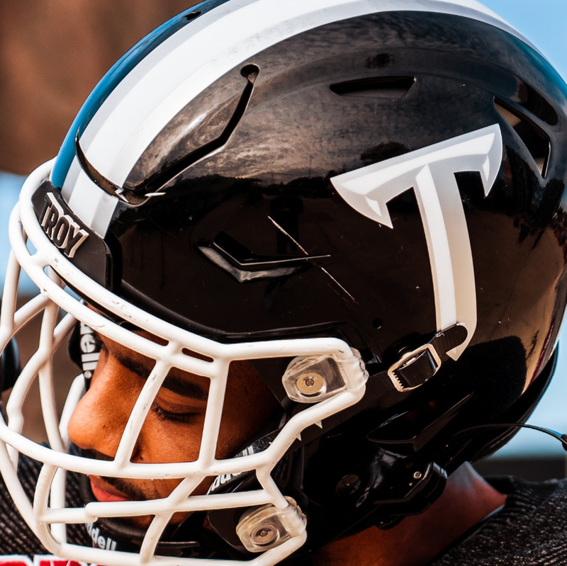
I’m always a big fan of finding new ways to pair up school colors. I was also extremely happy to see the return of the tri-stripes, especially in a way we haven’t really seen before.
While black and white are classic colors, it can sometimes be difficult to find a way that makes both work. By pairing the white with the silver in the decals, it allowed the black helmet to work as a canvas to let the white and silver pop off.
15. Cardinal Helmet with White Facemask and Bubble Troy Decal (1979-82)
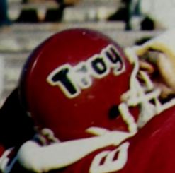
My love for the Bubble Troy helmet is very well known. This was one of the first non-National Title or 1990s Troy helmets I ever saw and I thank/blame it for my obssession with helmets, especially Troy’s.
While my personal opinion might have boosted this one a bit, in a historical sense, this was ahead of its time. Until 2020, this was the only time Troy had ever used “Troy” on a helmet. (I know Troy was featured on the Shield logo, but let’s face it, that logo had a lot going on.)
It may have made it too busy, but I would have loved to have seen the white/black/white stripe on this one too, though I’d have settled for more wins from Charlie Bradshaw.
14. Cardinal Helmet with White, Black, White Stripe, and Block Interlocked TS (1975)
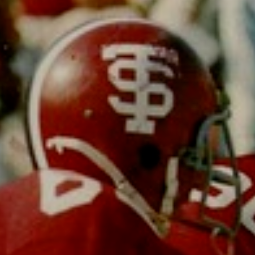
This is another design that I wish had gotten more time. The block TS was a fantastic look that would still be nice on a shirt or hat (hint, hint Trojan Threads).
To me, this was a great progression form the large T, little S of the 1968 helmet and something more in line with the aesthetics of the 1970s.
13. Cardinal Helmet with Cardinal Facemask, White, Chrome, White, Stripe, and Silver Power T (CCU, 2020)
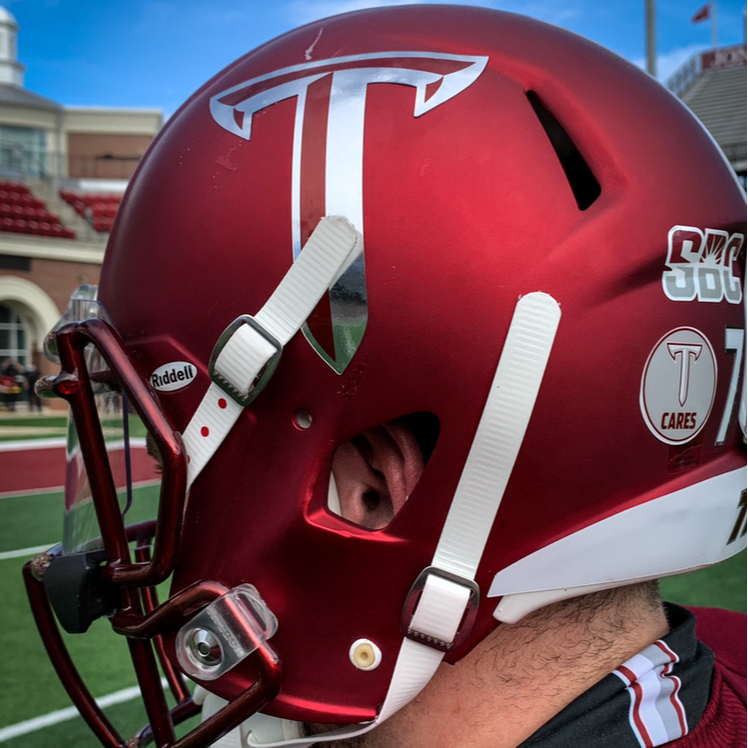
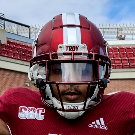
It’s very difficult to dedicate a helmet to as much of one color as possible and something that can be done poorly, but this look from 2020 made it work well. By using mostly silver and a little white for small contrast, Trojan Equipment pulled off a great-looking Cardinal Out.
This style was so good that it made the single color Power T look positively artlike.
12. White Helmet with Cardinal Facemask, Chrome, Cardinal, Chrome Stripe and Cardinal-Outlined Power T (🚫, 2019)
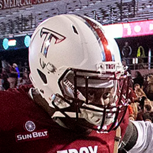
While I really love the Icy Whites, seeing pictures of these makes me miss the true white helmets. It was so refreshing when Troy brought them into the modern era in 2016. This ended up being one of my favorite looks because the decals absolutely jump off the helmet and the cardinal chrome facemask binds the whole thing together.
11. White Helmet with Silver Facemask and Stars and Stripes Power T and Stripe (2016-2021)
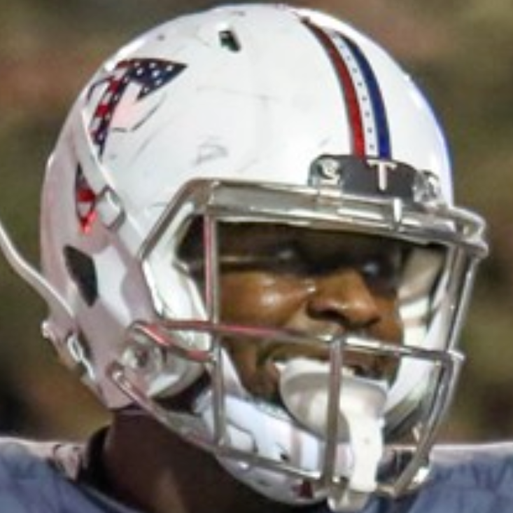
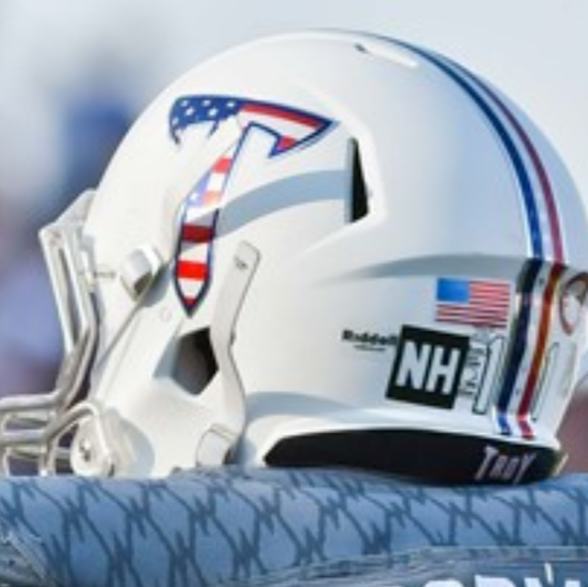
This lid went with the War Machines, a uniform set I actually wasn’t high on until it was used as the Military Appreciation set. This helmet instantly became a classic and a staple of the uniform set until it was replaced (perhaps for good?) in 2021 by our #10 choice.
The stripe is my favorite part of the helmet. It features stars down the white stripe and the red, white, blue layout is very similar to the 1976 Cowboys look.
10. Icy White Helmet with Cardinal Facemask and Stars and Stripe Troy Script and Stripe (Army, 2022)
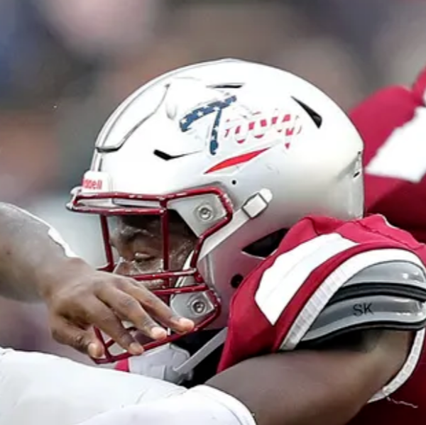
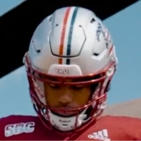
The new Military Appreciation look uses the same stars and stripe down the middle, but makes three big changes.
- Gone is the white helmet, replaced by the Icy Whites.
- The facemask was switched from a chrome to cardinal chrome.
- Most importantly, this marked the first appearance of the Stars and Stripes Troy script on a helmet.
As a design, it had been making the rounds for a couple of years (and admittedly, I had been annoying about using it on a helmet).
This one was going to be in my Top 3 until gameday. The Troy script was very difficult to see on the Icy Whites, which dropped this one a bit.
9. Chrome Dome with Cardinal Stripe and Facemask and Black-Outlined Power T (2015-2018)
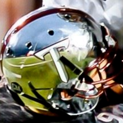
Initially, I didn’t want these. WKU had already made chrome helmets a staple of their uniform set and when we unveiled these, underwhelmed was an understatement for me. I felt they were gimmicky and a novelty and I held that opinion until September 30, 2017.
I’m not sure what happened, but after that, I really liked those helmets. I was sad to see them go, especially when their replacement was the Trojan Smokes.
8. Black Helmet with Black Facemask and TSU Marvin the Martin Logo (1999-2003)
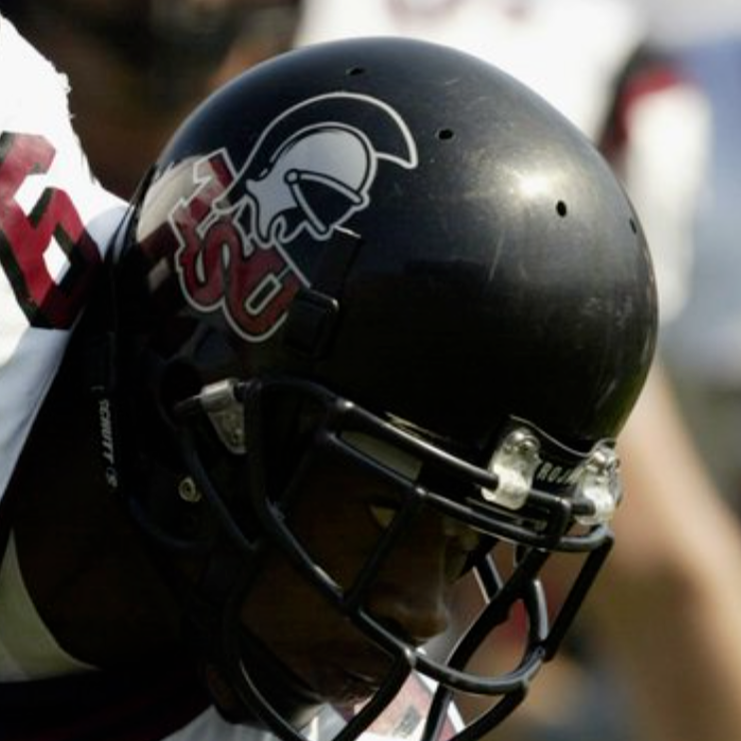
With the level of classic status this helmet has within the Troy community, it’s actually kind of crazy that it was only worn for five seasons. The all-black look of this era truly embodied the idea of The Mighty Trojan Death Machine that rolled through what was then Division I-AA.
By keeping the helmet and facemask the same color, it allowed the classic Marvin logo to pop right off the helmet. I’ve often thought about what a tri-stripe would look like on this one, but I’ve come to realize this one is perfect as it is.
Nothing could improve it, save maybe a D1-AA Championship.
7. Cardinal Helmet with Troy Shield and Sword Stripe (2004-2014)
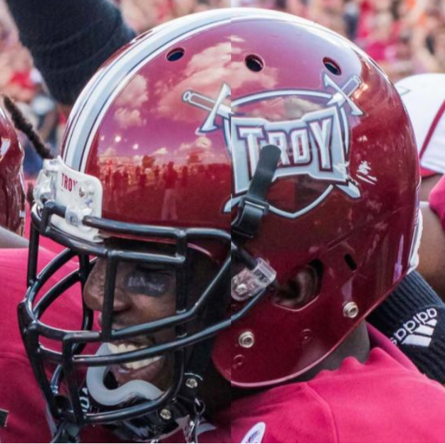
Based on time used, this is probably the single most identifiable Troy helmet in existence. While the Power T might work better now, the Shield logo saw Troy through some of her best moments at the FBS level.
Due to victories over Missouri and Oklahoma State and five straight Sun Belt titles, this helmet became what most people think of when they think of Troy. The Power T is shifting that, but ten years of use in a consistent look is hard to overcome.
My only real gripe with this helmet is that it is so busy from afar. The Shield with the swords and the TROY and the banner behind the word are all great details up close, but from afar, it just muddles into a blob in cardinal.
6. Cardinal Helmet with White Facemask, White, Black, White Stripe and Trojan Head Logo (1983-88)
Nothing gets Michigan State fans madder than this helmet. While Troy did use MSU’s iconic Spartan head during a key run in the 1980s, Michigan State was wearing a large block S. Troy also used them more effectively, winning two National Championships, 3 Conference Championships, and going 51-18-1.
As for the helmet, I have no notes on it. It is perfect. I love the continuation of the white/black/white tri-stripe. The elements all work well together.
The only reason this didn’t make the top 5 is that for all Troy did in it, it was someone else’s logo. When people see that logo, they call it the Spartan helmet, not the Trojan.
5. Cardinal Helmet with White, Black, White Stripe and Interlocked TS Logo (1968-71)
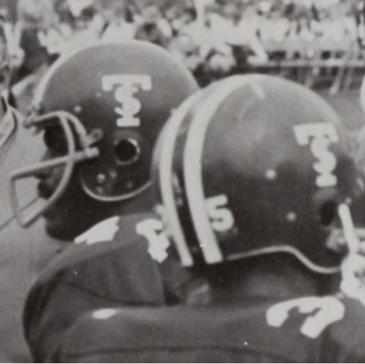
If the Marvin the Martians are a modern classic, this is the original classic. This helmet has basically everything I want from a Troy helmet: Cardinal base, white/black/white tri-stripe, and a simple and identifiable logo.
I know Troy was still the Red Wave at this point, but I believe that this helmet was the first time Troy truly created an identity that was wholly Troy.
4. Cardinal Chrome Helmet with White, Black, White Stripe and Interlocked TS Logo (FAMU, 2018)
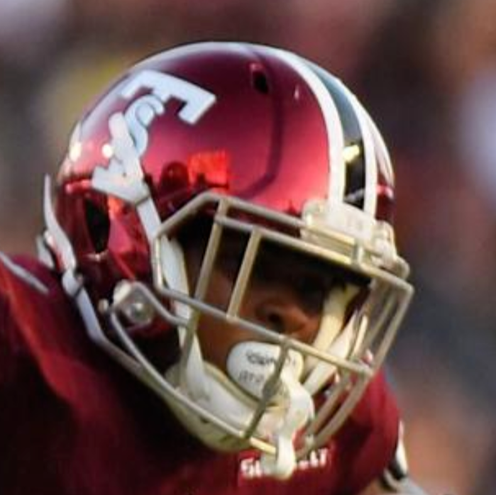
How can you top a classic helmet? It didn’t seem possible until Troy donned these in 2018. Every element is brought back completely, even the gray facemask (I know it’s silver, but work with me here.).
I absolutely loved the Cardinal Chrome helmet and thought the world of this design because it did what I believe effective throwbacks should do: shine a light on the past and future simultaneously.
3. Cardinal Chrome Helmet with White, Black, White Stripe and Power T (2018)
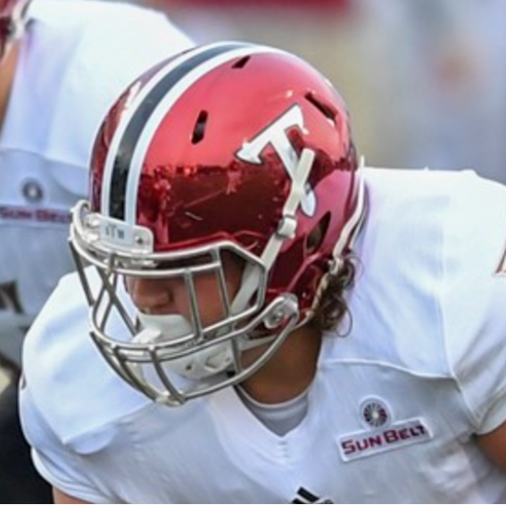
I’m pretty sure if you searched back through tweets in 2018, you’d see myself and others lobbying Troy to leave the stripes after the FAMU game. Thankfully, they did and it looked amazing.
This was a helmet that I had been wanting to see for years. This is what Troy would have look like if stripes never disappeared in the 1990s and 2000s.
While I loved the alternate tri-stripes for the white and black helmets in 2019, I was sad that these died out after only a few games in 2018.
2. Icy White Helmet with Cardinal, White, Cardinal Stripe, White Facemask, and Cardinal Power T (CCU, 2022)
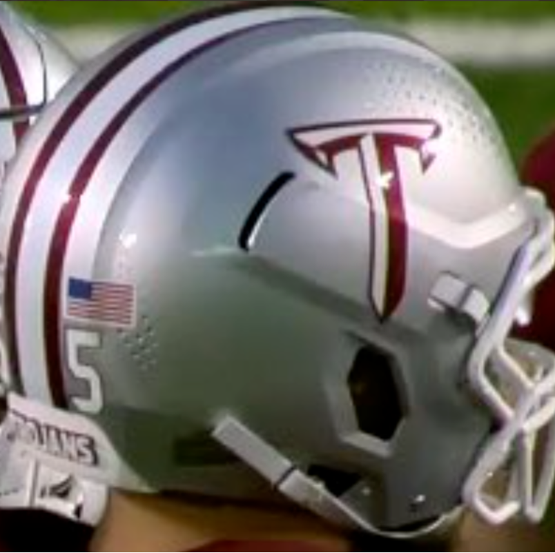
This is the absolute pinnacle of the Icy Whites. Yes, it does look like the Arkansas Cowboys helmet, but it’s amazing and I hope Troy brings it back for more games in 2023. This was a championship level look.
Everything worked great together and complemented each other perfectly. The cardinal/white/cardinal tri-stripe worked great with the white facemask and the white and cardinal neck bumper.
If there was anything that I would have altered on this, I would have used a Power T that was white and cardinal to fit in more with the stripe coloring. As it is though, 10/10, no (other) notes.
1. Cardinal Helmet with White Facemask and Stripe and Troy script (Texas State, 2022)
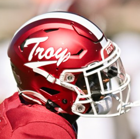
If you have followed me on Twitter or talked helmets with me at any point, then you shouldn’t be surprised and should have known this was coming.
I called for the usage of the Troy script on a helmet for three years. I can only assume that Trojan Equipment finally did it to get me to stop asking.
Normally, I would want the tri-stripe, but I won’t be here. Script decals are a classic look with years of great lids throughout college football history. Adding more would only detract from what is a great lid.
This Troy script is reminiscent of a few Troy State scripts from the 1970s, but is modern and looks great in almost every context. White and Cardinal lets the script stand out while not overloading the helmet with too many colors or too many elements.
To me, this is the greatest helmet in Troy’s illustrious history. Now let’s see what 2023 has in store for these rankings.
As always, let me know in the comments or on Twitter (@BenOnSports) what you think of the list and what you might have done differently.

