The Most Unique Uniforms in Troy History
As far back as one can find, Troy football has used great looking uniforms. Most of them have been a standard, traditional look: solid colors, single or triple stripes on helmets, sleeves and pants, and simple helmet designs. Nothing boring, just classic.
From the 1930s and 40s to the present day, Troy has established that classic look without going too wild with any look… with one exception.
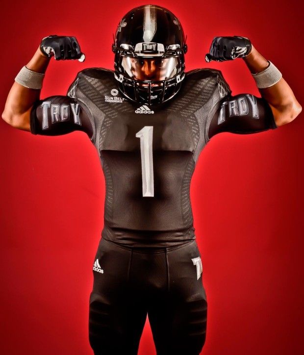
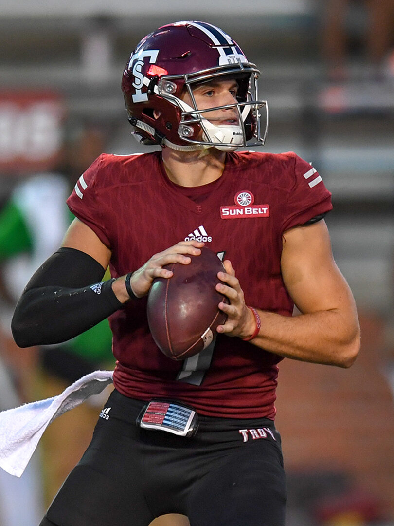
The uniforms in question were not a one-off look like the fauxback looks or Blackouts.
Troy’s standard home and away looks have been relatively the same since modern uniforms were introduced. From the thirties until about 1952, the Red Wave wore dark-colored uniforms of the day, akin to a heavy sweater and cargo shorts.
The first modern uniform was introduced in 1952, when Troy wore white pants with a single cardinal stripe and a simple white jerseys with cardinal numbers.
The pants seemed to have been partially used in 1951, but were used the main pants going forward. Due to a lack of pictures in the 1953 Palladium, I am unsure if cardinal jerseys were used that year.
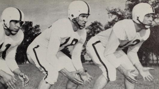
What is certain is that the main look was complete in 1953. Troy wore a white helmet with cardinal stripe, cardinal jersey with white numbers, and white pants with a single cardinal stripe at home. The away uniforms were the same, save the white jersey with cardinal numbers.
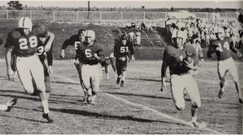
From this point until the 1990s, Troy’s home and away looks would be basically the same, with a sleeve stripe or pants stripe change here, a TV number and helmet stripe there, and most importantly, the introduction of the cardinal helmet in 1966.
In 1993, black and silver became fashionable in the Wiregrass, relegating cardinal and white to accent color status. Even as the Troy’s colorway made a drastic shift, the uniform template stayed very traditional. It was a solid color jersey, with TV numbers and silver pants with no stripes.
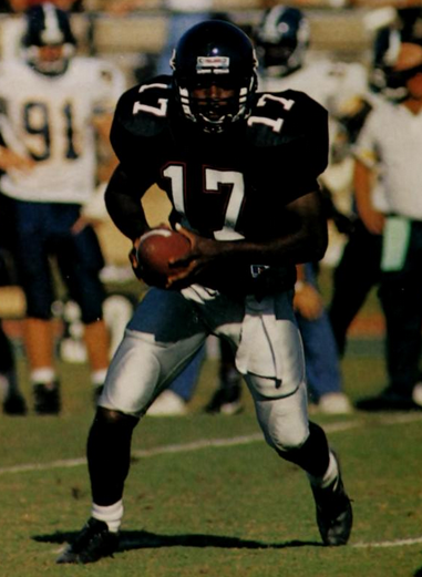
The aways were the same design, but for the first time, the numbers on the jerseys were black instead of cardinal. The biggest change from 1993-1999 was the introduction of the first black helmets in team history.
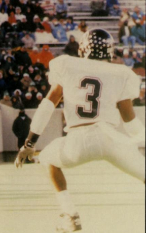
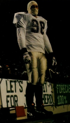
In the 2000s, the cardinal and white jerseys returned as Troy began its move to FBS, or Division I-A. With some tweaks and additions, the jerseys and pants remained within the established uniform tradition Troy has built up over the past 70 years.
Then came the biggest deviation from that tradition at any point in Troy’s history: the 2002-2004 jerseys.
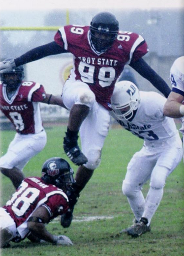
The reason these are so fascinating is that for the first time in Troy’s history the jersey went with the current trend in uniform design, rather than sticking to tradition.
No Troy jerseys before or since have ever used side-piping or over the shoulder stripes. Much less have the two been combined, producing an interesting dual stripe pattern up the side and over the shoulders.
On the home jerseys, white from the side panel formed much of the stripe, but a black ring provided a buffer between the white and cardinal at the end of the sleeve. The away versions flipped this with black in the side panel, a cardinal ring, and white sleeves.
Also, where some jerseys featured outlines on the numbers, this set introduced a drop shadow for the first time.
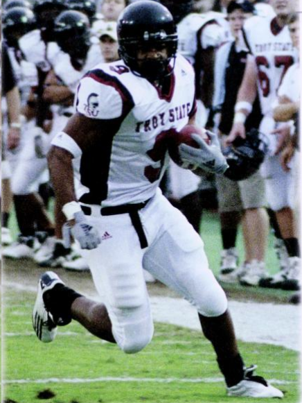
This created a look unique to Troy, but not in the larger landscape of 2000s football. While not an exact match, teams like Utah, West Virginia, Boise State, Texas Tech, and even Miami used side panels and new stripe styles to enhance their look on the gridiron.
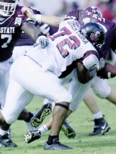
The other big features of this uniform set were two things that, according to our research, Troy had never done before.
First was the use of the primary logo on the sleeve. With the helmet decal, now you had two chances to see the glory of “Marvin the Martin” on each side of the Trojan uniforms.
Second, these uniforms marked the first time the team name—Troy State—was written on the front of the football jersey, a tradition that continues to this day with the bold TROY on the front of Troy’s current set.
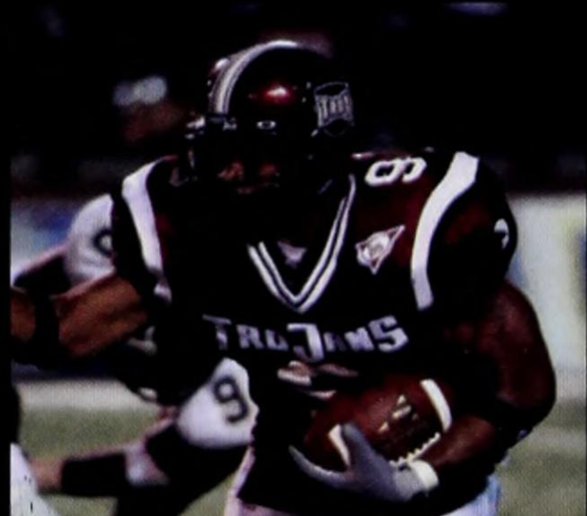
For all the firsts this pioneering design brought, the 2004 version of the uniforms, nearly unchanged, still stand out as the most unique.
That year, Troy State’s campuses became One Great University, formally uniting under the new name—Troy University.
This also brought the first big creative change in Athletics branding. The Shield helmet logo was introduced at the first home game against Missouri, further cementing that win as a major moment in Troy football history.
The branding came with a whole barrage of new imagery: the beveled wordmarks, the cartoon Hector logo, the sword T and even the now-ubiquitous Power T.
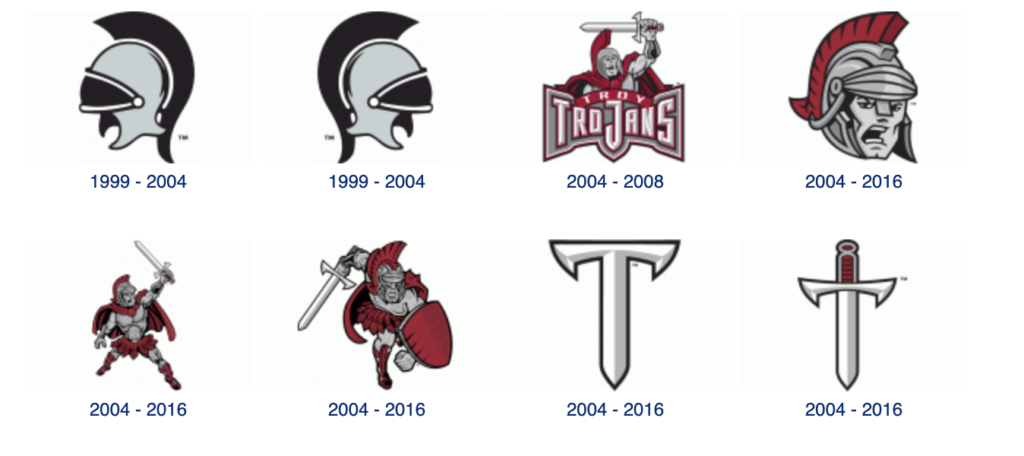
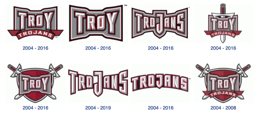
Screengrabs courtesy of Sportslogos.net
As such, having “Troy State” on the front of the Jerseys wouldn’t work with the new identity. Instead, the nickname replaced it, specifically the “TroJanS” wordmark logo.
There’s a dispute as to whether the logo was ironed or sewn over the old Troy State, but photo evidence isn’t conclusive.
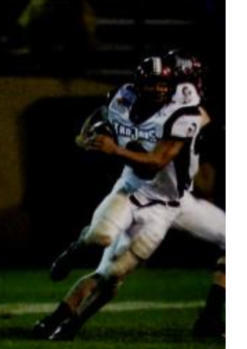
Oddly enough, this jersey still struggled with an identity crisis: the “Marvin the Martian” logos remained on the sleeves. A hybrid like this would not fly
Another way of looking at this mismatched design is the link it creates between the future and the past.
Trojans of a certain age love these uniforms for what they were, a building block to a bigger future. Troy was a team, a fan base, and even a University in transition.
Nothing showcases that better than these uniforms, the most unique look Troy ever wore.

