The Ultimate Helmet Ranking of Troy, Part 2 (26-47)
We’re a third of the way through this list. Last time we went through most of the helmets from the early years of Troy football.
As we get closer to the top ten, we’ll see more modern helmets… though some classic styles are still waiting to show up.
47. White Helmet with Silver Facemask, Decals, and Silver, Cardinal, Silver Stripe (2019-2020)
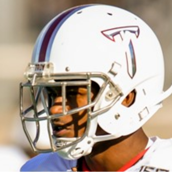
This look was nearly perfect, but sometimes the chrome facemask and decals on white helmets kind of meld together into one from. I love that Trojan Equipment brought back the tri-stripe after the FAMU game in 2018, refreshing it to match each color helmet in 2019.
46. Chrome Dome with Cardinal-Outlined Power T, Cardinal Facemask, and Black, Cardinal, Black Stripe (2019)
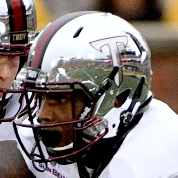
As I said in #48, the updated tri-stripes looked great. This one gets dinged not for what it is, but for what it isn’t.
The Chrome Domes, which I initially hated, became instantly iconic on Sept. 30, 2017. After that, it’s kind of hard to mess with perfection.
45. Cardinal Helmet with Digi-Camo Decals (Louisiana, 2021)
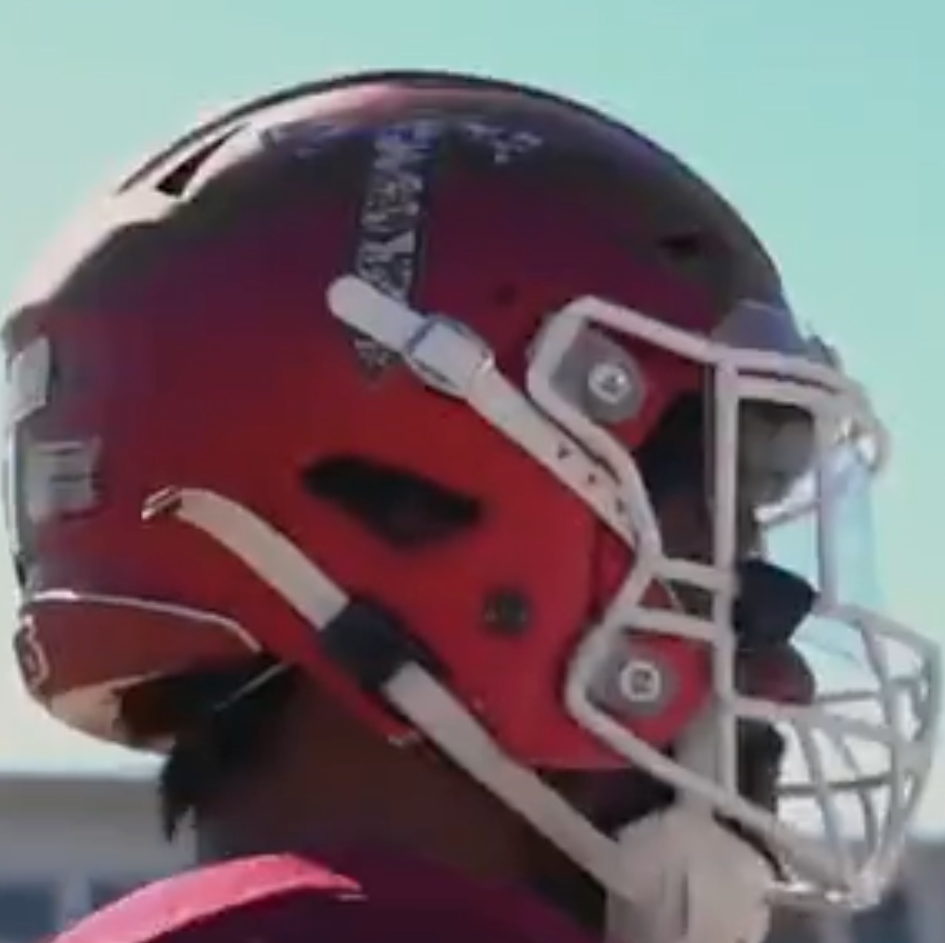
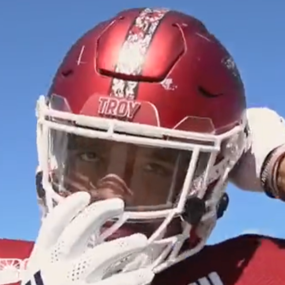
Digi-camo is such a unique design, especially with the cardinal stripe. Unfortunately for this one, the abundance of cardinal was the problem. Everything just bled together. Thankfully, Trojan Equipment went with the white facemask for some contrast.
The fact that the white version looks so much better didn’t help.
44. Chrome Dome with Black, Cardinal, Black Stripe, Cardinal and Black Power T, and Cardinal Facemask (App State, 2019)
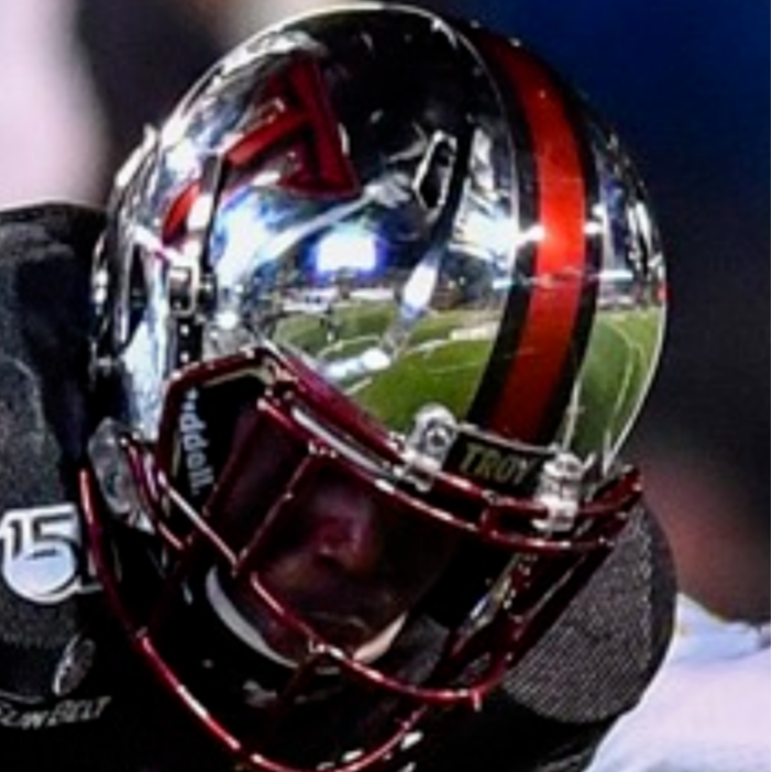
The picture above tells you all need to know about why this helmet is so low. I’ll talk more about my appreciation for the Chrome Domes later, but even though I like the idea behind this decal set, the reflection ate up the decals and made them difficult to see.
Maybe a daytime game might have improved it? I would love to see Trojan Equipment bring this back with the Icy Whites though.
43. Cardinal Chrome Helmet, Silver Stripe and Facemask, and White and Silver Power T (2017)
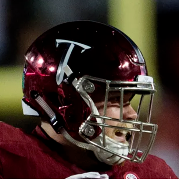
This is another one that surprised me to find it this low. I loved the Cardinal Chrome, but it is just a couple of steps away from a better version.
42. White Helmet with Digi-Camo Decals and Chrome Facemask (CCU, 2017)
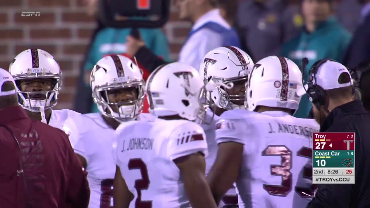
This is definitely the better version of the digi-camos and I love them almost as much as Marcus Jones loved running back kickoffs versus Coastal in them. These really dropped because the digi-camo wasn’t as noticeable from a distance. Honestly, competition is just very tough from this point on.
41. Silver Helmets with Cardinal Decals, Cardinal Wide-Stripe, and Cardinal Facemask (2022)
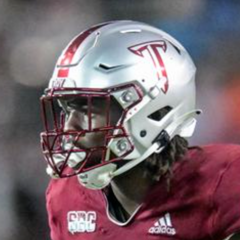
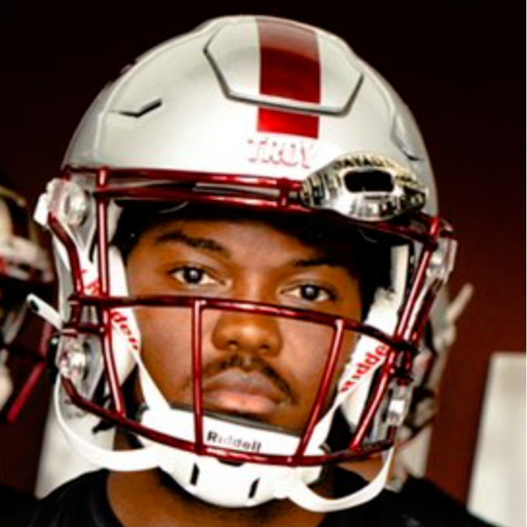
This first iteration of the Icy Whites worked really well and looked great. My only issue on this is that the Icy Whites just happened to look much better after this one.
40. White Helmet with Cardinal Facemask and Wide Stripe with Cardinal and Black Decals (Texas State, 2021)
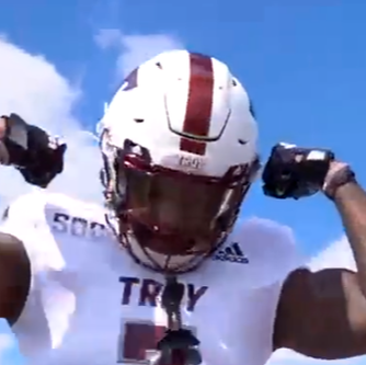
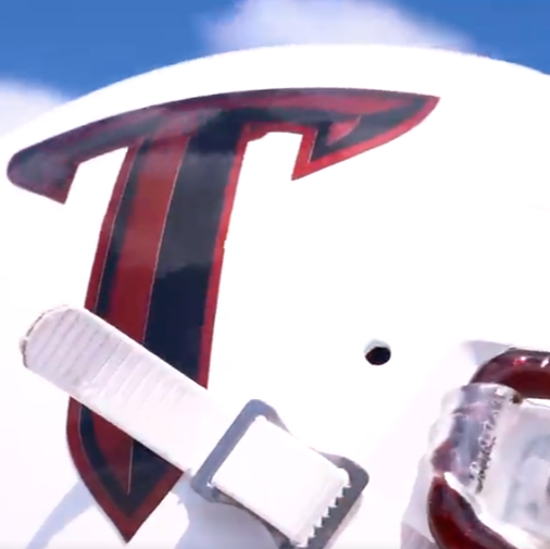
Contrast still plays a part in why this is low, but I loved the attempt to use the colors in a different way. There aren’t many cardinal and black Power Ts floating around so it was fun to see, especially on the white helmet.
39. White Helmet with Cardinal Facemask, Cardinal Wide Stripe, and Cardinal and Silver Decals (CCU, 2021)
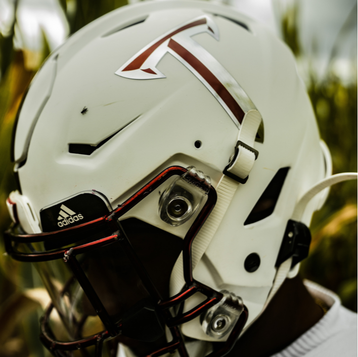
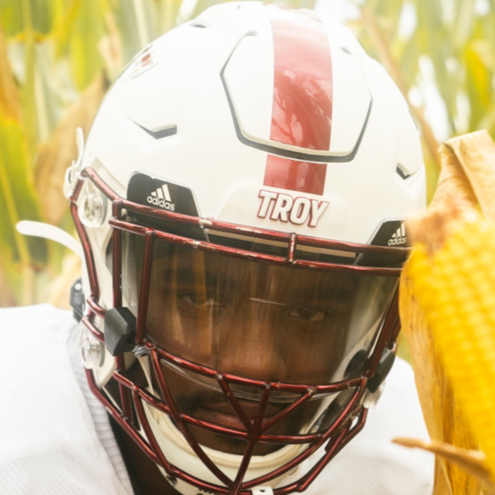
While #40 and #41 are practically the same, the chrome silver in the Power T just works that little bit better. The white provides a great canvas for the cardinal to shine on.
38. Trojan Smoke with TSU Decals (Georgia Southern, 2021)
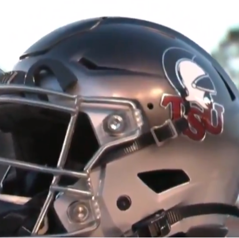
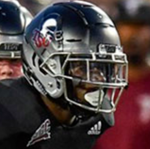
The only reason this one gets ranked so low is due to the Trojan Smokes. While I loved this one and it ranked highly in my Uniform Rankings in 2022, two problems persist.
First, the gradient made it hard to see the logo. Second, the helmet on the logos should both be facing forward, but the left sides were facing the rear of the helmet.
37. Black Helmets with Silver Decals, Stripe, and Facemask (WKU, 2022)
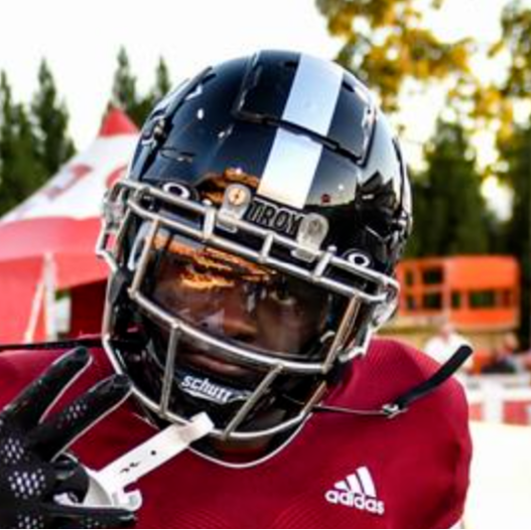
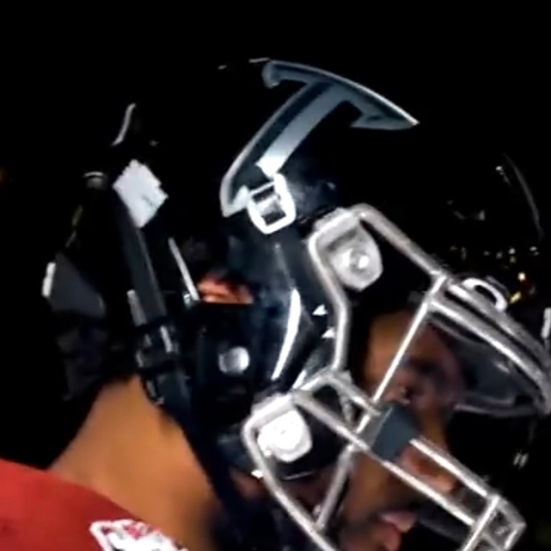
Sleek and modern, the black and silver is a great combination. I would love to see this in a black uniform set, especially in a night game.
36. Black Helmets with White Decals, Stripe, and Facemask (Marshall, 2022)
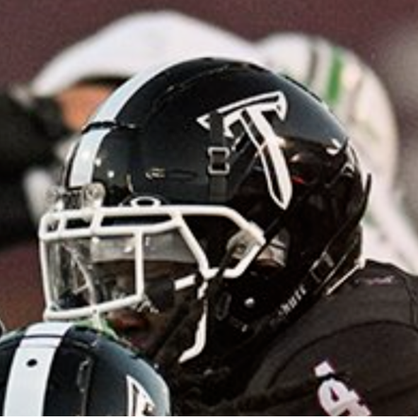
Kind of like the previous one, I love the use of a single color on black helmets. The cardinal tends to blend into the black since they both are so dark. The white just pops a tad better than the silver here. The fact that Carlton Martial practically demolished this helmet didn’t hurt either.
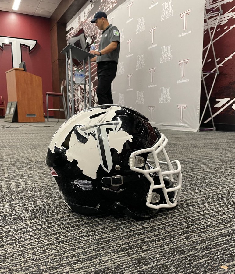
35. Black Helmets with Cardinal Facemask, Stripe, and Cardinal and Silver Decals (Cure Bowl, 2022)
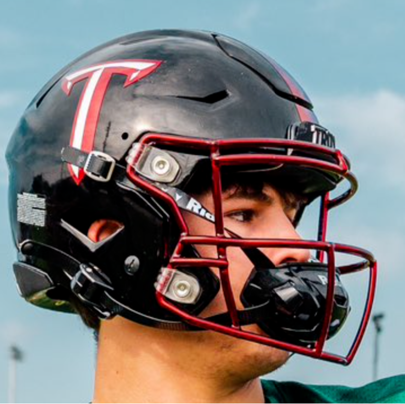
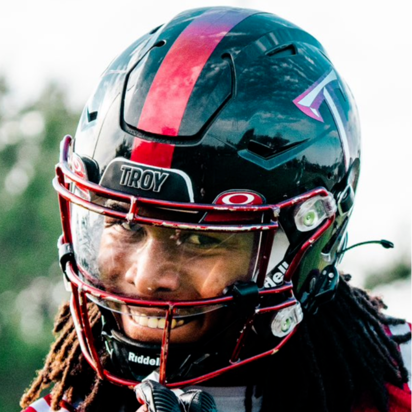
This was a great way to incorporate the cardinal and white on a black helmet. I love the pop of the cardinal facemask under that cardinal stripe. However, this is only the third best black helmet from 2022.
34. Cardinal Helmets with Matte Black Stripe, Silver Facemask, and White and Black Decals (Arkansas State, 2022)
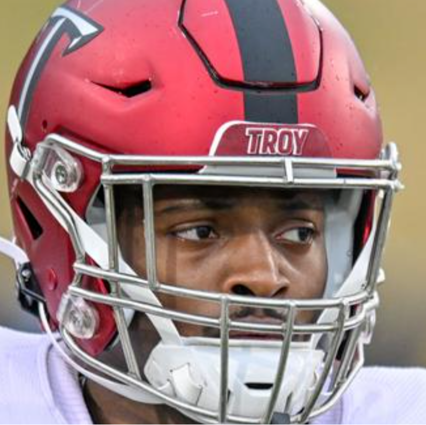
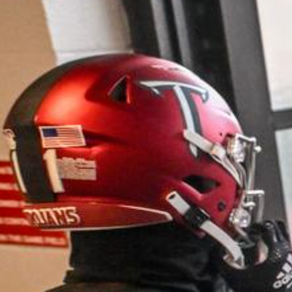
I loved what Trojan Equipment was able to do with this one. Matte stripes and decals were a very unique look and it made for a strange dichotomy.
On the one hand, the matte muted the black, but in doing so, it made the cardinal pop like crazy. This is definitely an underrated look and I wouldn’t mind seeing it return.
33. Trojan Smoke Helmets with Cardinal Facemask and Cardinal, Silver, and White Power T (Georgia Southern, 2020 & ULM, 2021)
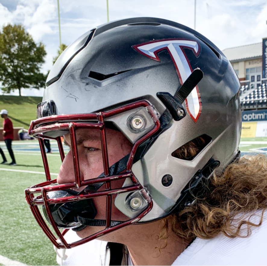
This was easily the best version of the Trojan Smokes Troy ever used. I know there are plenty of folks who like these, but the gradient is just something I couldn’t get past.
The inclusion of the cardinal in the facemask and the outline of the Power T helped considerably to boost this one.
32. White Helmets with Silver Facemask, Silver, Cardinal, Silver Stripe, and Cardinal and Silver Power T (App State, 2020)
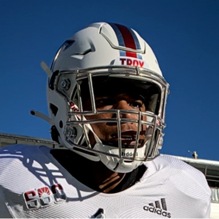
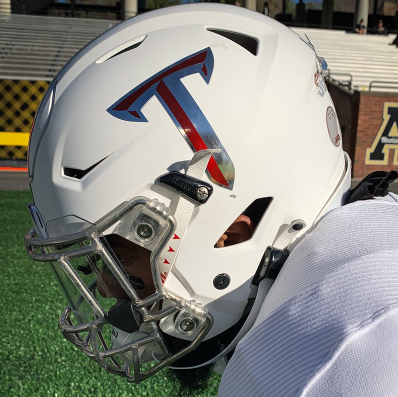
I’m always a sucker for tri-stripes and this is no different. This is a chrome heavy look, but it works well enough and accentuates the cardinal on the stripe and Power T.
31. Cardinal Helmet with White, Silver, White Stripe, Silver Facemask, and White and Silver Power T (2019-2022)
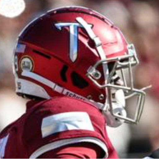
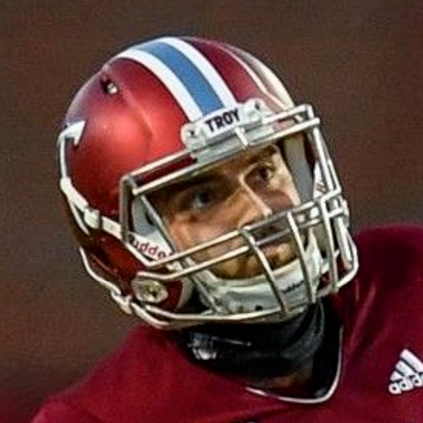
This one is so close, SO CLOSE to being perfect, but the tri-stripe killed this version of the cardinal helmet. As I’ve said before, the white/black/white stripe should be our standard stripe for the cardinal helmets.
While I was glad to see these remain in 2019, I was disappointed when the pictures came out and the black was replaced by silver.
30. Cardinal Helmet with Gray/White Facemask and Black and White Oval T (1976-78)
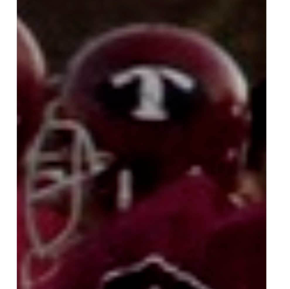
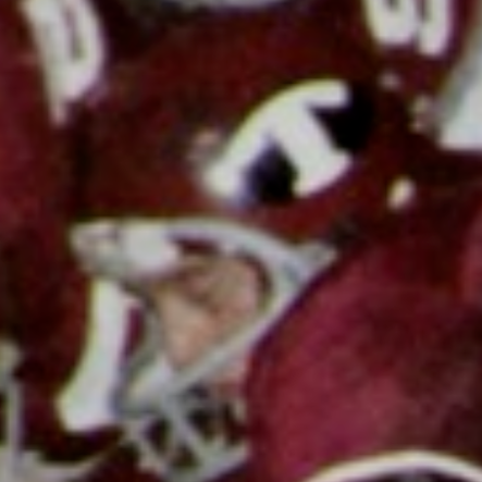
Several teams have used designs in this same vein, but I really wish this particular Oval T lasted a little longer. It was probably the second most interesting logo Troy used during the 1970s.
29. Cardinal Helmet with Black Facemask, Silver, Black, Silver Stripe, and Trojan Head Logo (1989-91)
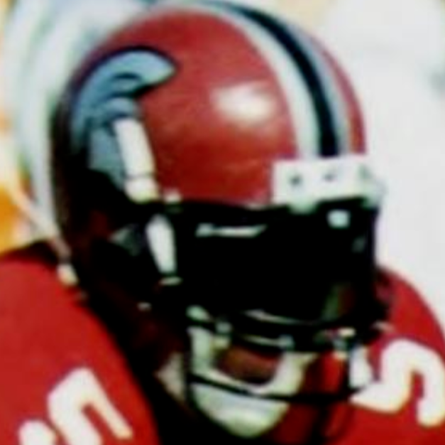
This is about as nitpicky as I can get. The Maddox Helmet is great, but the black facemask didn’t work for this version. The white facemask version already worked perfectly.
28. Cardinal Helmet with Silver, Black, Silver Stripe, Black Facemask, and Large Helmet Logo (1992)
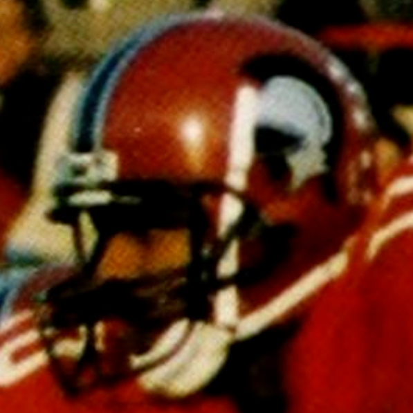
What a difference a logo can make. Where the Spartan helmet didn’t work on this helmet, Marvin the Martian looked amazing.
The larger amount of black in the logo helped tie the facemask and stripes together. It was a great look to start the Blakeney era.
27. Black Helmet and Facemask with White Helmet Outline in Two Sizes (1993-1998)
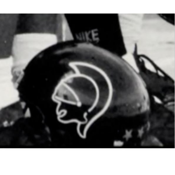
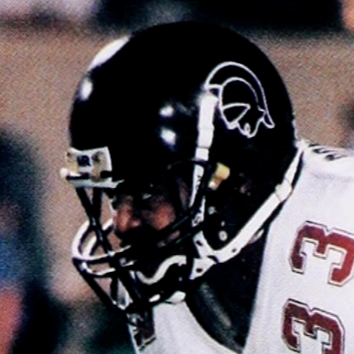
The Blakeney era also brought about the most significant change in helmets in Troy history up to that point, when Troy switched to black helmets and a white outline of Marvin.
This is such a simple look that worked so well. No one else was wearing anything on their helmets like this at the time and it served as a great template for Troy as it found FCS success in the mid 90s.
26. Cardinal Helmet with Block TSU Decal (1972)
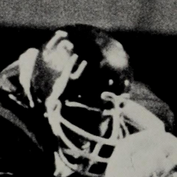
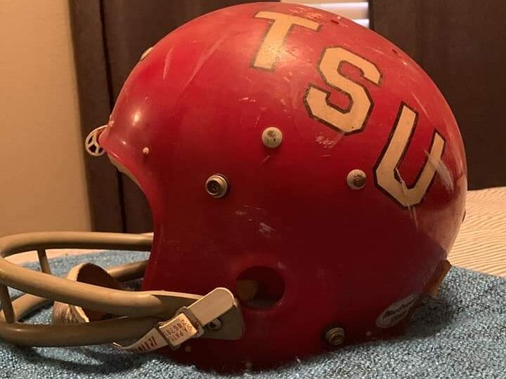
So many universities have used a (Initial)-S-U decal on their helmets and I’m glad that for at least one season, Troy did the same. I am a huge fan of block initial logos and this one on a clear shell helmet looks amazing.
That’s it for Part 2. Check back soon for Part 3 and don’t forget to let me know your thoughts on the list here in the comments or on Twitter (@BenOnSports).

