

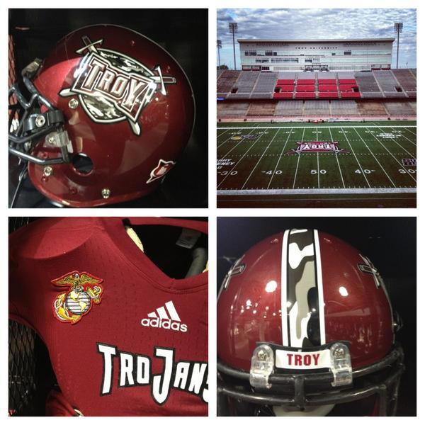
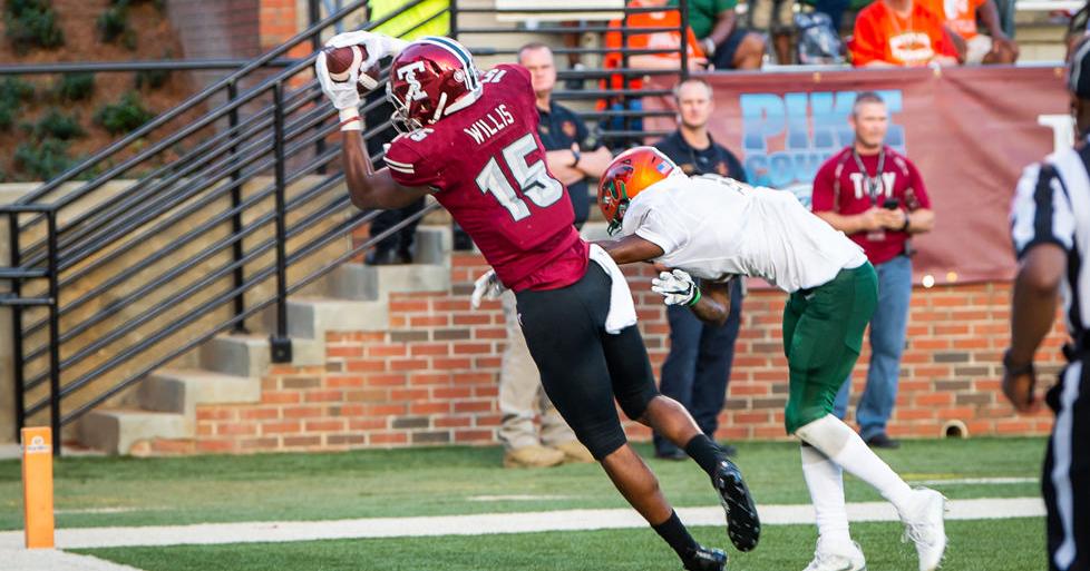
Alternate History: Ranking Troy’s Helmet Designs
Throughout Troy’s illustrious 112 year history, the team has worn several great helmets. Most of these have been used consistently and for a number of years. But with the recent trend towards new uniforms and combinations, Troy has embraced diverse looks with great success.
The Trojan Equipment staff has done a great job of finding new and different combinations of decals, facemasks, and shells to create special looks that showcase the team in the best way.
Even with these new changes, Troy has still had some alternate and one-off helmets that stood out from the now-standard changes to the traditional helmet. Since 2004, Troy has used twelve distinct alternate helmets*. These designs were either only used once or changed the traditional helmet enough to make it unique.
*Editor’s note: These are alternate helmet designs, such as throwbacks, not alternate design elements themselves, like the red-and-black Power T or the chrome helmet.
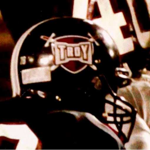
#12 vs Marshall, 2004
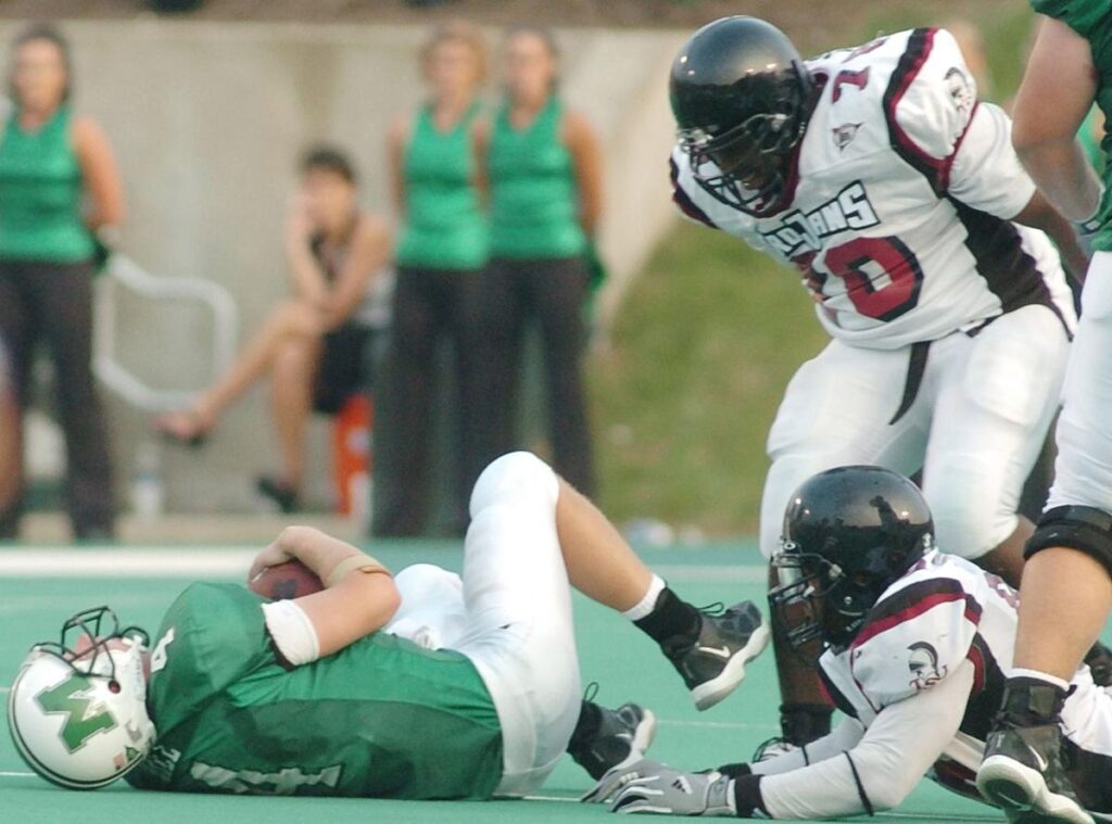
The only reason that this helmet is last on the list is because it is nothing but a blank, black shell. This entry requires some context though.
2004 was a transition year for Troy, as the college changed its name from Troy State University to Troy University. The first game of that season was a return trip to Huntington, West Virginia, to face off against the Marshall Thundering Herd.
Athletics was also undergoing a rebrand for the new Troy era and did not want to reveal its new logos and helmets in an away game. They saved that reveal for the next game: a Thursday night matchup with #17 Missouri on ESPN2.
After that game, the entire college football world would know Troy’s name… and Junior Louissaint’s too!
#11 vs App State and Georgia State, 2021
I was not certain on whether to include these as they are so new, but the design is unlike anything Troy has ever worn before.
Troy has never worn an oversized logo on the helmet before and this one was featured on the left side of the helmet. The other side featured a number. It’s the first time since 1966 Troy has worn a number on its helmet and the first time since 1965 a number was placed on a white helmet.
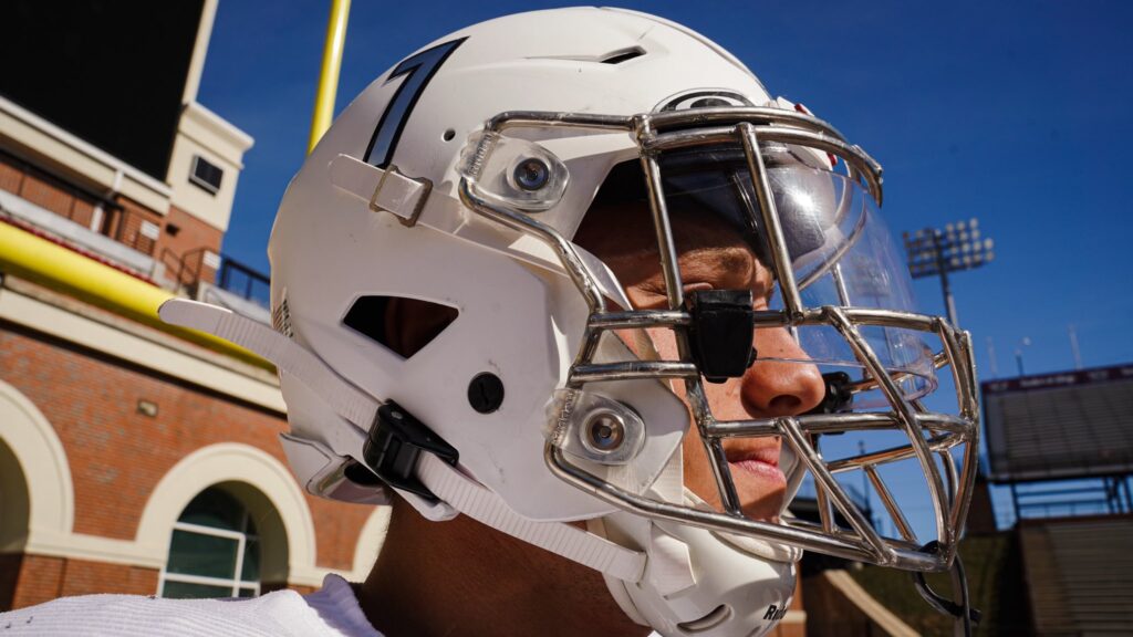
Trojan Equipment previewed this look at T-Day 2021 when they put the #12 on the side of the helmet in memory of Trojan Legend Sim Byrd. It remains to be seen if this setup comes back next season, but it worked fairly well as a modern alternate for Troy this year.
#10 vs BYU, 2020

For the first time since 1982 and the second time ever, Troy played in a helmet with the word “Troy” emblazoned on the side. I detailed my issues with this helmet back in my 2020 Uniform Rankings.
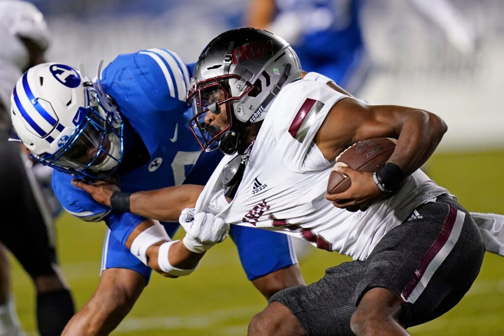
Overall, I think the TROY wordmark would’ve been more legible on a white helmet, especially on national TV, than the Smoke helmet allowed. It’s not a knock on the concept though.
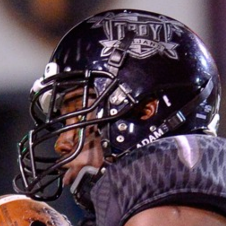
#9 vs Georgia Southern, 2021

The return of the “Marvin the Martian” or “Space Knight” logo was a truly welcome sight after 18 years. Had this not been on the Smoke helmets (which was understandable since Trojan Equipment didn’t have a black shell), it would’ve been much higher on my list, probably near the other two fauxbacks (which will be mentioned later.)

This particular alternate suffers from the same problem as the TROY Smoke helmet in general. Parts of it look great, while others get hidden in the Smoke.
Twitter user @TheDocRFP, a former equipment manager from the days when this was the standard decal, said that his main gripe was that the helmet decals did not both face forward like they did from 1998-2003. However, fellow TTW writer Thomas Gleaton believes the likely reason for this is as a cost-saving measure to avoid printing two different sets of decals.
#8 vs ULM and Louisiana, 2013
The first full Blackout in Troy history featured a helmet that was a black and silver version of the standard Troy Shield logo. The biggest changes were the addition of the sword blade in place of the helmet stripe, and you know, making the helmet black.
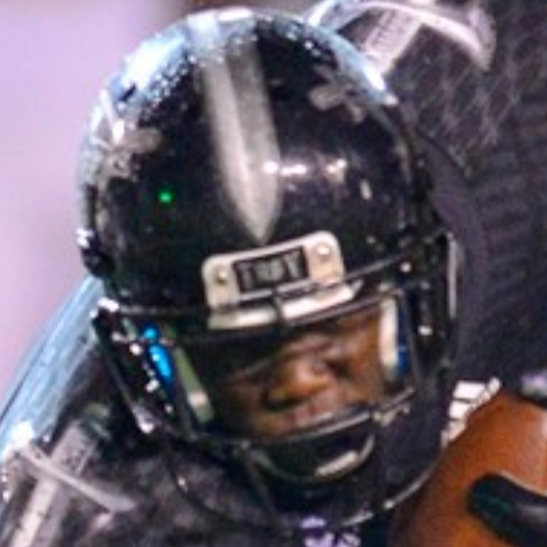
In my opinion, the helmet was the best part of this uniform. The only things that I would’ve done differently would be a chrome facemask to match the chrome decals and adding a bit of white in the logo to make it stand out more.
It provided a good template on how black could look when reincorporated into the modern Troy uniforms, and thankfully it has been brought back better since these two games in 2013.
#7 (tie) vs Coastal Carolina, 2017 and Louisiana, 2021
The Digi-Camo decals are one of better alternate decal sets that Trojan Equipment has used over the past few years. It has only been used twice, once on a white helmet and again on a cardinal one. I think I like it more on the white helmet, but it works just as well on cardinal.
Both Digi-Camo games have been played the week of or on Veterans Day. I know that we already have an established separate tradition for our Military Appreciation games, but I wouldn’t be mad at the Digi-Camos becoming the default “Veterans Day” decal set.
Speaking of which…
#6 Military Appreciation, Multiple Uses from 2016-21
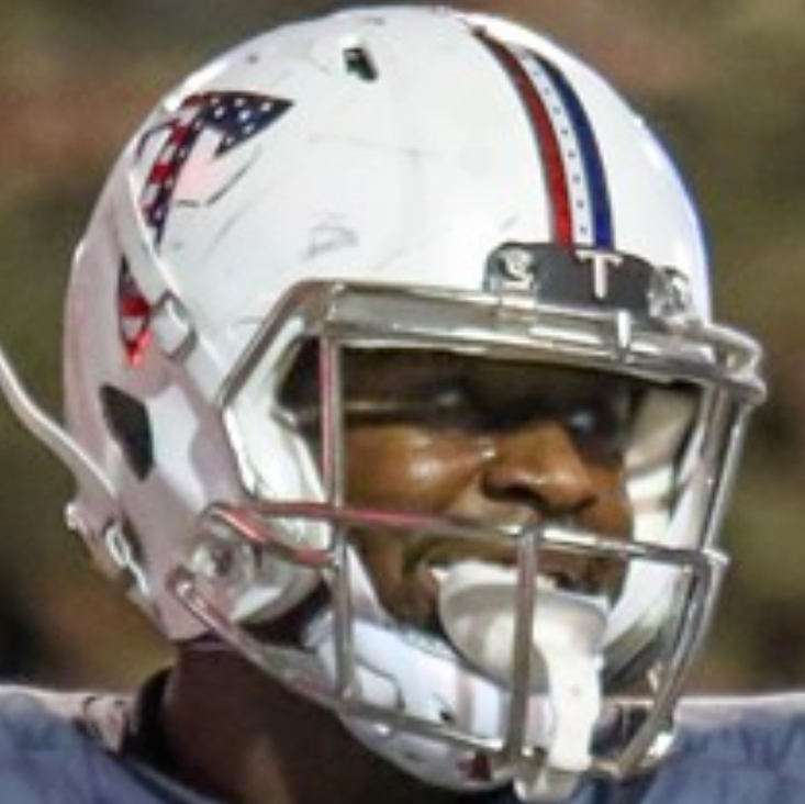
Thomas already covered the Military Appreciation uniforms in depth in 2020, but the helmets themselves have become a staple, regardless of the uniforms worn with them. While Troy has had a special Military Appreciation game for years, the Stars and Stripes decals didn’t make it onto the helmets until 2016 against App State. Since then, it has been used once every year (Akron, Coastal, Arkansas State, MTSU, and Liberty).

I love these completely and there is nothing that I would change. One of my favorite aspects is the red, white, and blue stripe which brings to mind the 1976 Dallas Cowboys helmet. I also really like the stars in the white of the stripe as well.
#5 Camo vs Navy, 2012
The original Military Appreciation helmet debuted during Navy’s 2012 trip to the Wiregrass. The special decals were done for the 237th birthday of the Marines, which was on the actual date of the game. The logo of the Marines was also included on the Trojans’ uniform.
Camo is a pattern that can easily be overdone and look gaudy, but I think that Trojan Equipment did a great job of incorporating the camo naturally into the standard helmet. I also really like how the black and white stripe looked on the shield helmet.
#2 Division II Champs vs Southern Miss, 2019 and 2022

The ire of Michigan State fans came down on Troy when these were brought out, but that’s only because it looked better in cardinal. Troy honored the 35th anniversary of the 1984 Division II National Champion teams by bringing back the Trojan helmet logo, with a few modern updates.
Trojan Equipment modernized these in a great way, opting for chrome logos and a chrome facemask. My only gripe with this was the replacement of the black helmet stripe with the chrome.
Troy has used the white/black/white tri-stripe off and on since the late 1960s. If we are going to use a tri-stripe, a classic look is always a good way to go. That said, it matches the decal and that earns points.
#3 Al Lucas Tribute vs FIU, 2005

We’ve talked before about Trojan Legend (and hopefully College Football Hall of Famer) Al Lucas, but the FIU game in 2005 was Troy’s tribute to him. By my count, it was the first official “Blackout” game, honoring the player who had died tragically during an Arena Football game in April of that year.
Troy decided to honor the 1999 Buck Buchanan Award winner in the only way they knew how: donning the uniform he wore during his playing days. The Trojans wore the exact same black jerseys from the late 90s and the silver pants from that same era.
Adidas didn’t seem to have a problem with the Trojans wearing Russell uniforms for just one game.
The biggest change was the use of the new shield logo and sword stripe on the black shell. This gave Trojan fans an idea of what the 2004 rebrand would’ve looked like if they hadn’t gone back to cardinal after the 11 year hiatus.
#2 1968 vs FAMU, 2018

If there was ever a perfect helmet in the Troy equipment room, it is this one. The 1967-71 team was the first to wear a helmet logo and in 1968, it was the first to don the white/black/white helmet stripe. Troy honored the 50th anniversary of Troy’s first National Championship team by breaking out the old interlocked TS and stripe again.
Unlike the 1984 alternate, Trojan Equipment let this helmet sing all on its own. The TS is a perfect logo and if the University still went Troy State, I would lobby my heart out to make it our primary logo again. While I love the Power T, I wouldn’t mind seeing the block T make an appearance on the modern helmets at some point.
The only real difference between this and the original 1968 version is the cardinal chrome helmet Troy used at the time. It’s also worth noting that the success of this look inspired Equipment to use the tri-stripe for the next two and a half years.
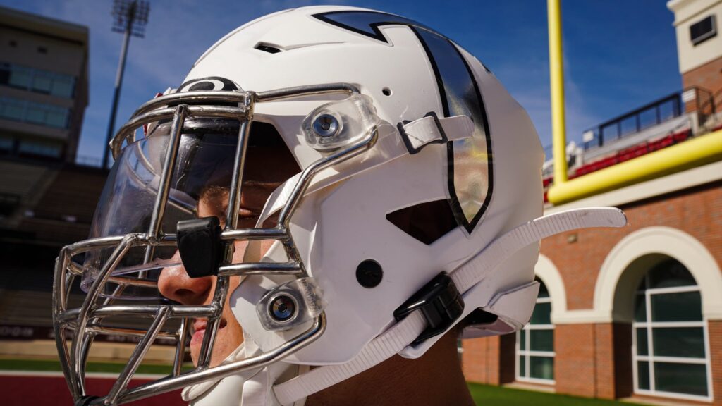
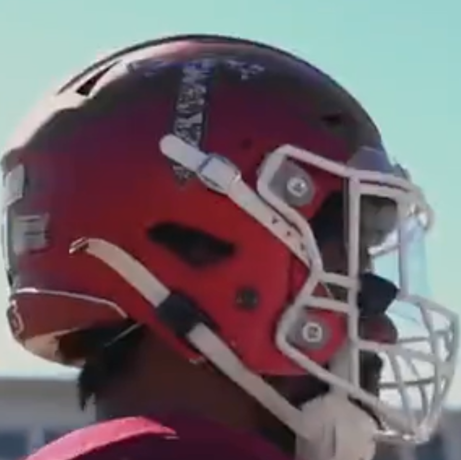
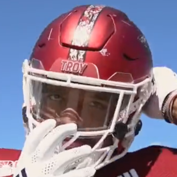
#1 – Troy Script vs Texas State, 2022
I have been calling for this since at least 2020 (the earliest tweet I could find mentioning it). Script wordmarks on a helmet are easily one of my favorite looks on a helmet. Heck, even South’s “South” and “Jaguars” looked great. The Troy script marked only the third time in Troy’s illustrious history that the name of the university was donned on the helmet.

This helmet, in my opinion, is near perfect. It brings in a new element with the script, but doesn’t overcrowd it on the helmet. The white facemask and stripe give it color continuity with the script. The best part is that the cardinal helmet helps the white of the helmet to pop from anywhere on the field. I can’t thank Brent Jones and Trojan Equipment enough for making this happen. I only hope this won’t be a one-off appearance.
As always, I hope you enjoyed the list. Let me know in the comments or on Twitter (@BenOnSports) what you think, what I might have left off, or what else you’d like to read about.
Great article! I enjoyed reading it!